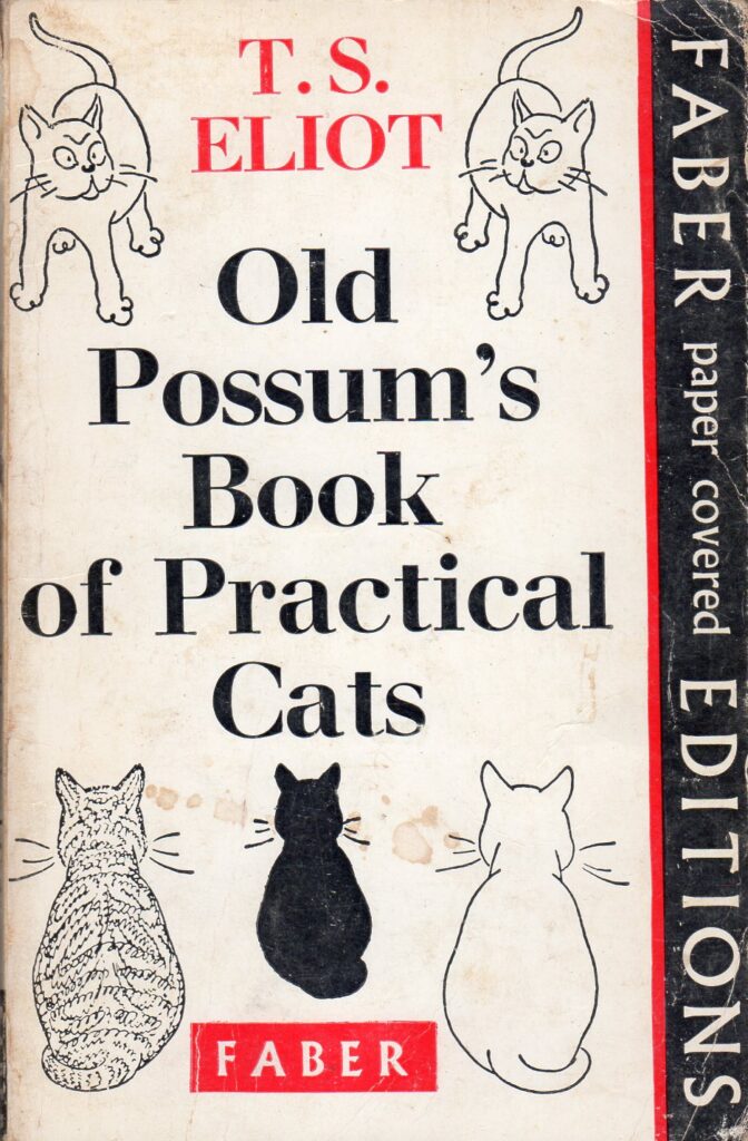
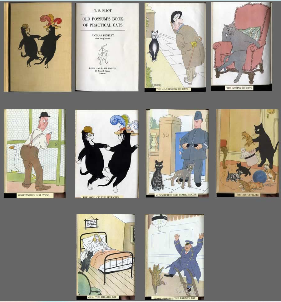
My initial thoughts when asked to choose a poem, was to choose something from ‘The old Possums Book of Practical Cats’. A book I remember studying, in music (Andrew Lloyd Webber’s musical) I had images in my head of fonts made up from the lythe shapes of cats, kittying across the page. Whilst this still might be a thing I realised upon opening the book that the best first line is from Skimbleshanks; The Railway cat;
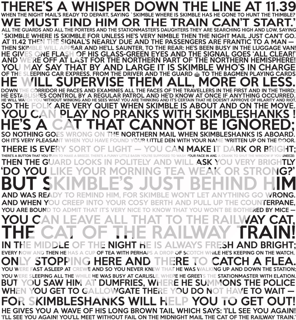
‘There’s a whisper down the line at 11.39‘
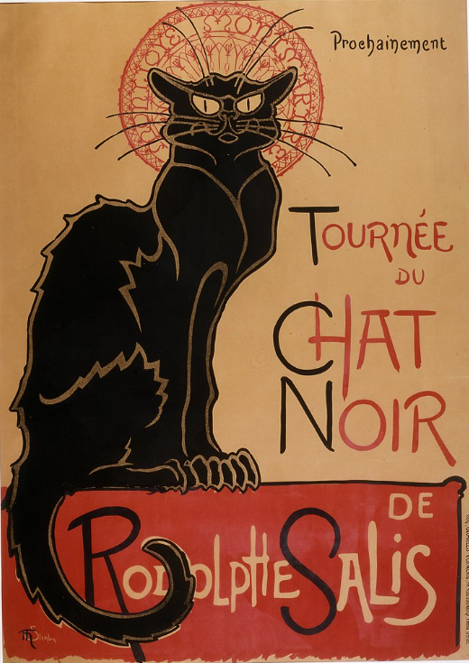
the Chat Noir . I feel if I was to tackle this poem I would get caught up in illustrating the poem, telling the story, rather than designing a font.
So I had a look about and decided to choose: Woodland Burial by Pam Ayres. It has a simpler theme, and whilst it still tells a story, it isn’t quite as involved as Skimbleshanks. It also feeds back to my response to the Curiosity and Insight brief; the cyclical essence of the natural world.
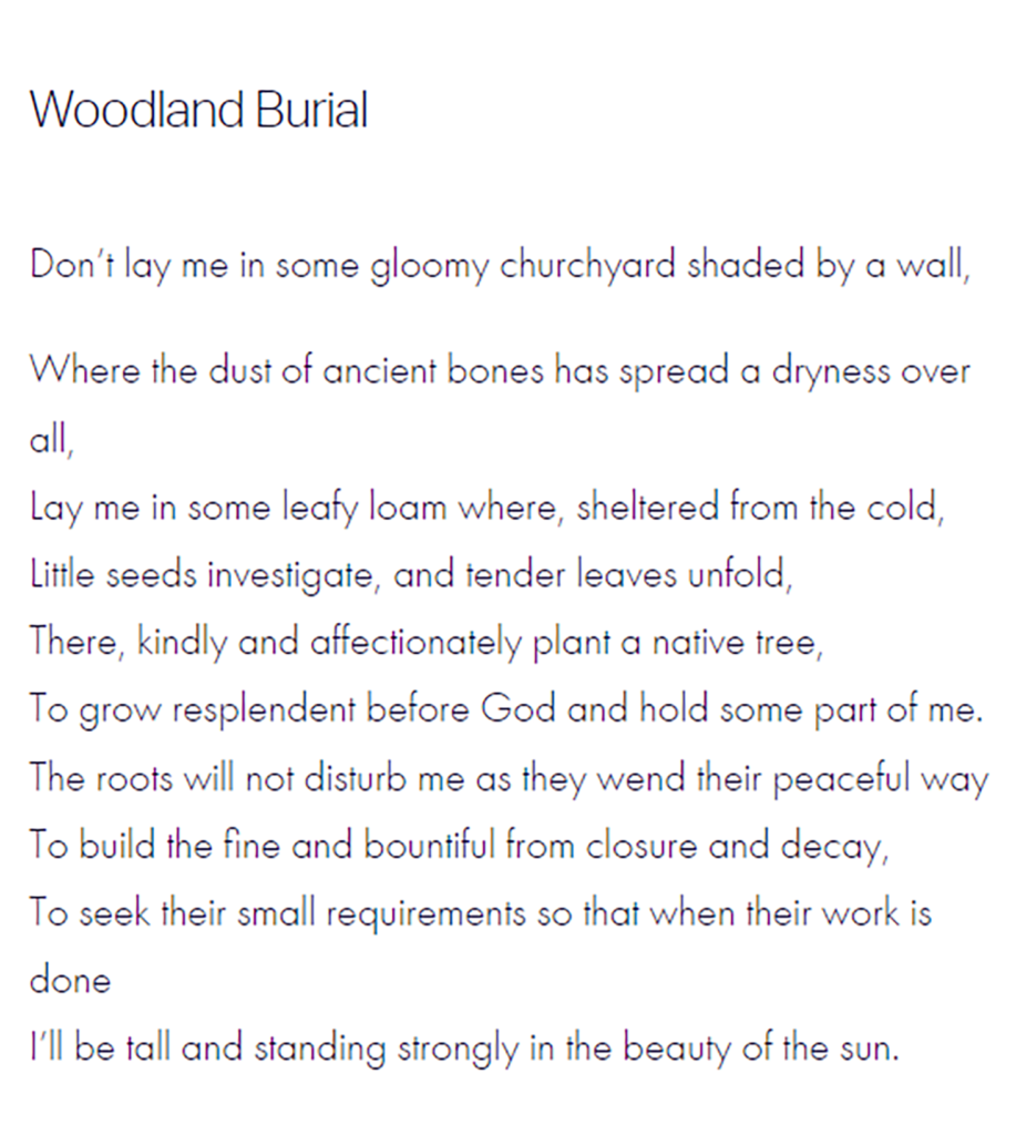
The feelings this poem depict are positive, retuning to nature, the cyclical nature of particles, how we are all part of the same universe.
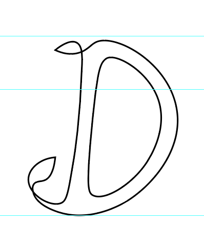
I have been inspired by Atypical’s Chelsea flower show font, which has organic flow yet remains legible.
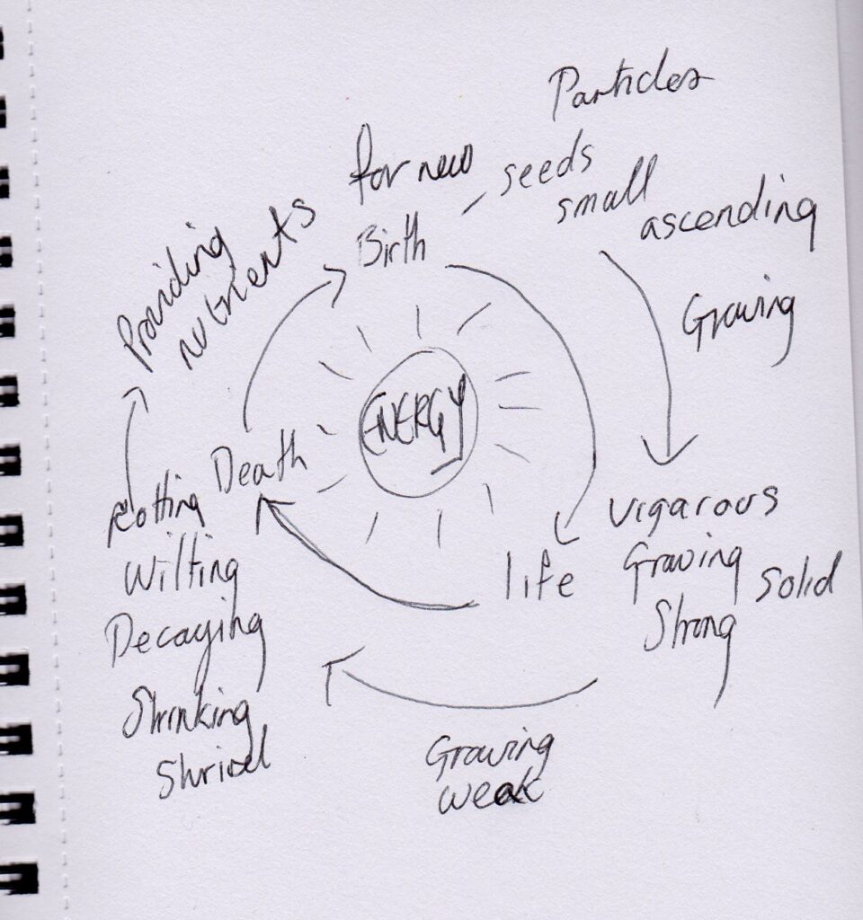
The cycle of the poem
First doodlings with Illustrator. I initially thought of making the font in Illustrator with an organic shape, then thought perhaps I could have a simpler shape but fill it with drawn leaves and pattern. Next I thought ‘why not use real nature?’ So I will be out and about with my camera to see what I can come up with. I may visit the local cemetery, as well as the woodland burial ground in Wootton, a couple of miles from Ryde (if I’m aloud in).
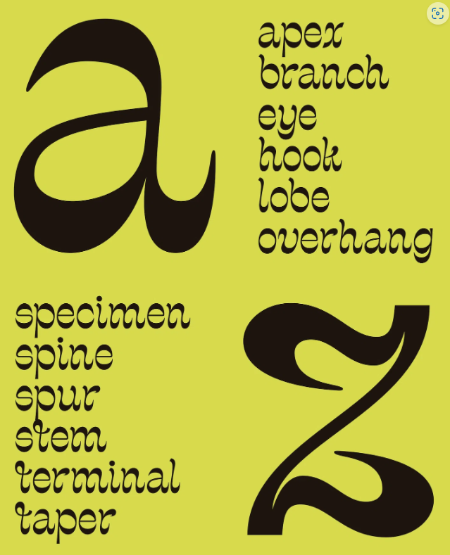
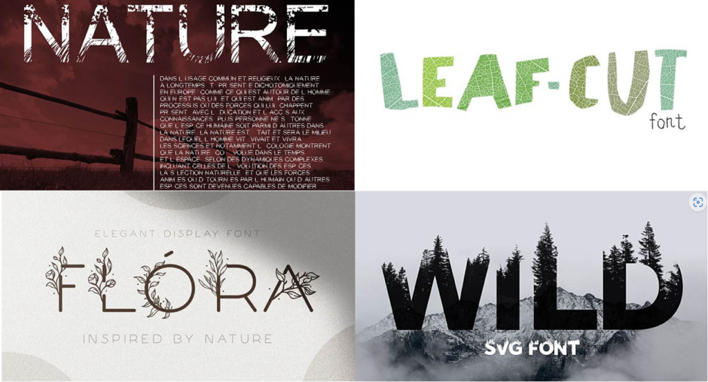
Some nature inspired fonts
Ferhill Park Woodland Burial Grounds, Wooton, Isle of Wight (woodland-burials.co.uk)
After the workshop unpacked talk this morning I have decided to change back to my original poem by TS Elliot
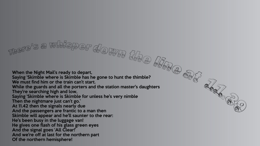
The first line; There’s a whisper down the line at 11.39,
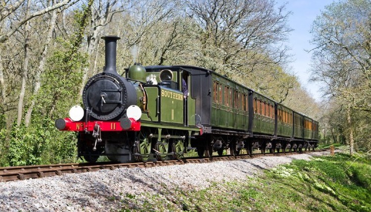
The Isle of Wight Steam Railway is inspiration for this line, noting yet about cats and kittens, but I’m sure that will follow when I take the main body of the text.
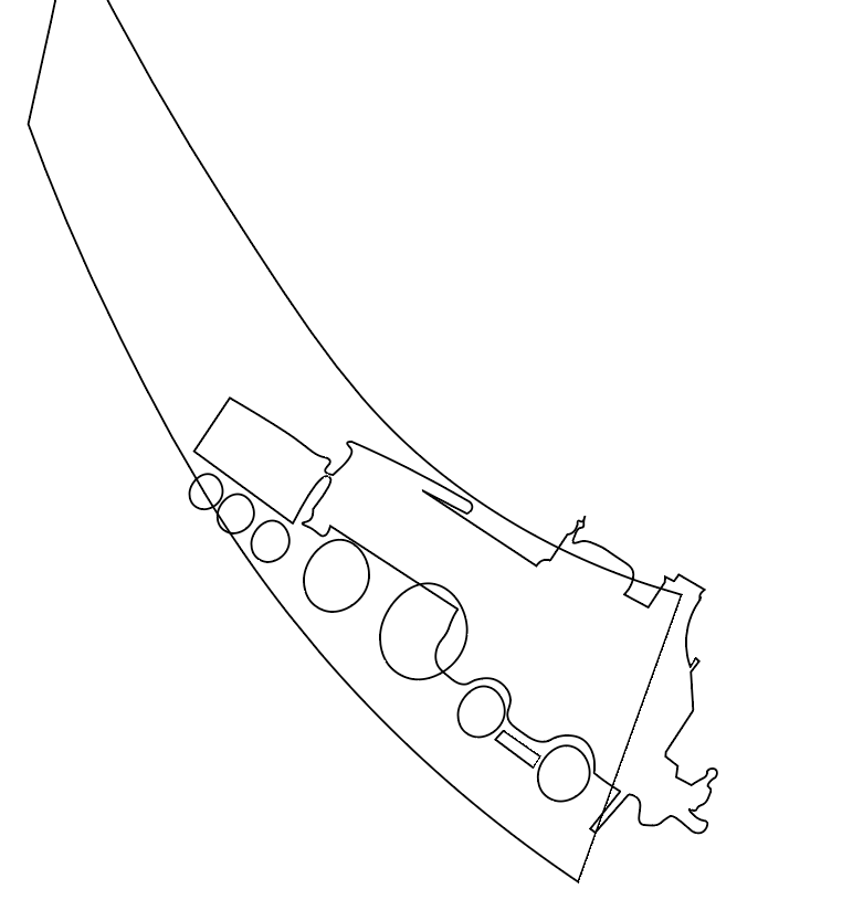
Thinking of the train I chose a font and wrote it out a few times, with the idea of basing my font on an existing one, as I haven’t done this before I thought it would be a good place to start.
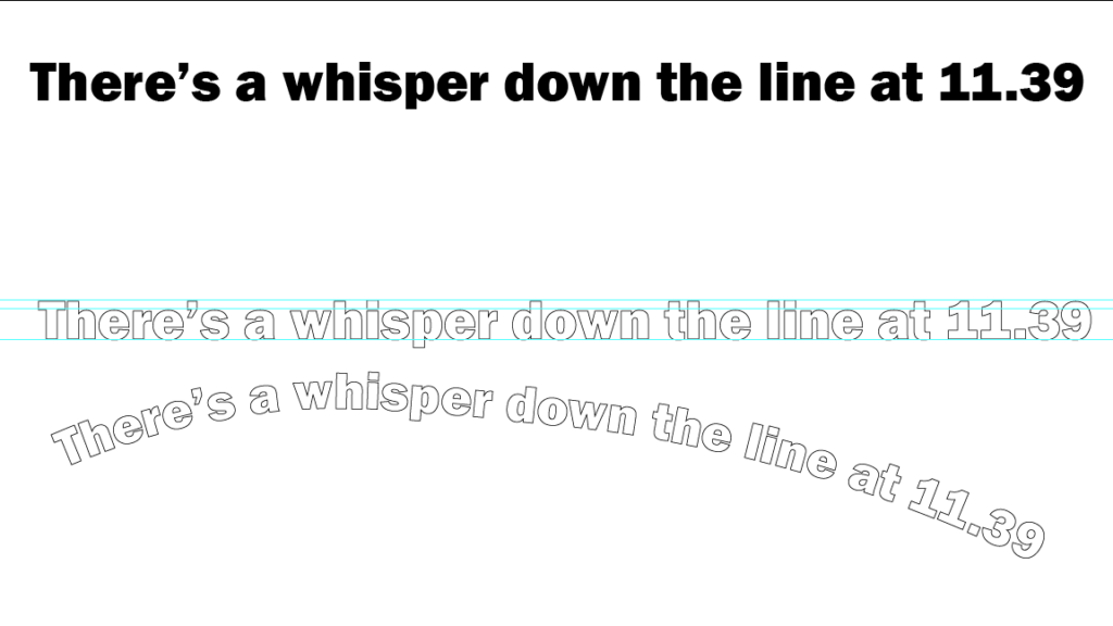
Using this font as a base I first started playing around with the 3 and 9, the front end of the train.
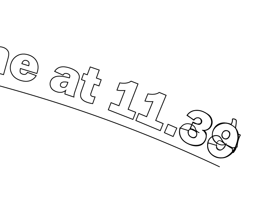
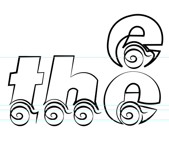
Trying to make the letters have wheels, like the wheels of a train
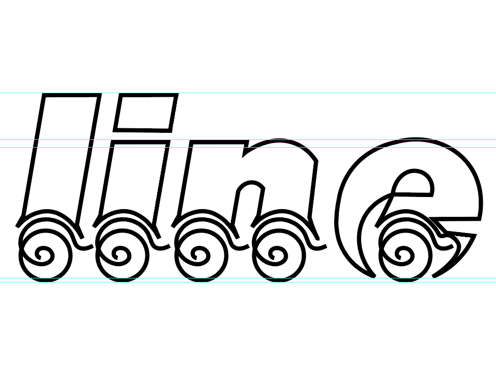
Playing about with different letters, the e felt too comlpicated next to the other letters so I reconfigured it
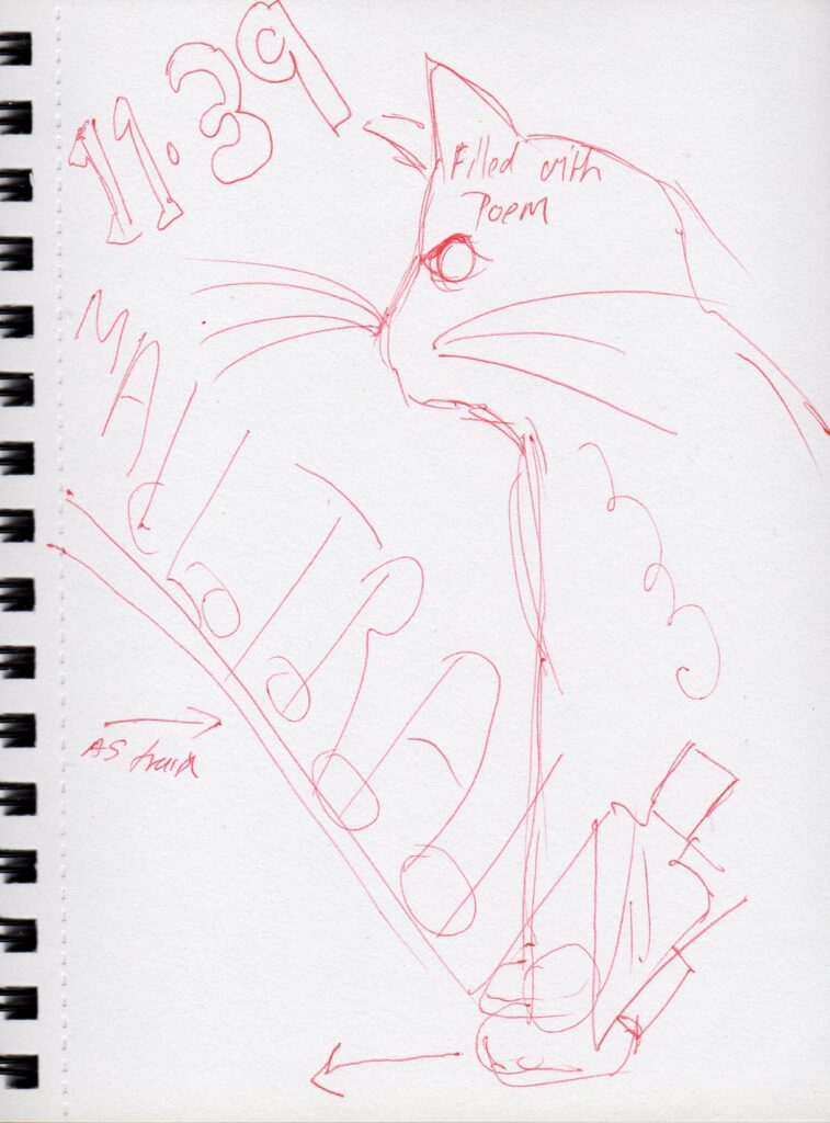
My initial idea for layout of type, I am inspired by the Chat Noir, by Theophile Steinlen.
I have stated to work in Illustrator for my layout, I would love the time to get my screens out the loft and do a mixed media combination of digital and print. I don’t have the time this week (or emulsion) to expose screens, but could possibly stencil with paper. I may use lino if I can locate some on the Island, online delivery wouldn’t arrive in time to complete the task! I like the print finish of the black cat, which I won’t be able to achieve digitally. Note. no lino available to purchase on the Island.
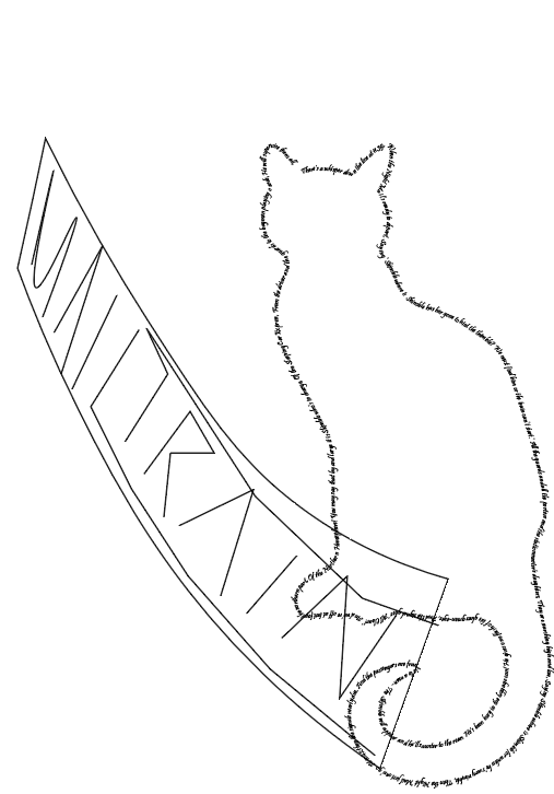
The cat outline is the first verse of the poem. This I would keep digital, with the train either lino cut or screen printed
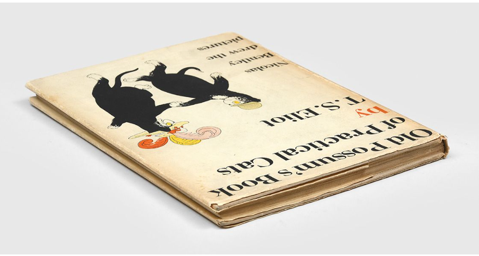
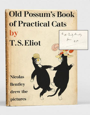
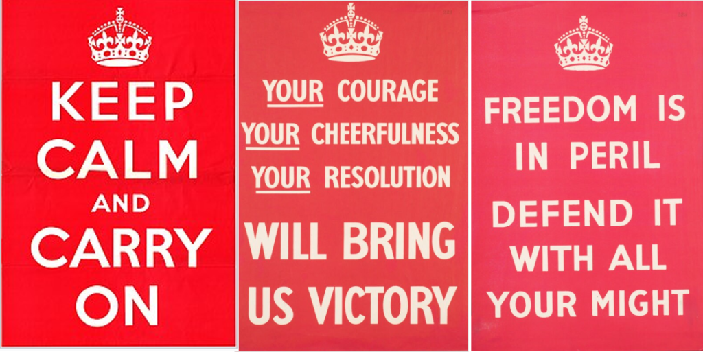
Feeling a bit tired and not sure of the direction my design was going in. I came away from my computer and decided I needed a break, over a glass of red the thought occurred to me that I should probably be looking at the year the book was published for my inspiration. It was first published in 1939, the steam train fits with this era, but I’m not sure about the rest of it. I also discovered the original book had a cloth cover, and found online a picture of a first print run selling for rather a lot of money. So I shall move away from the Chat Noir and take a look at designs and posters of 1939.
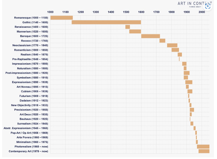
Dure to WW2 a lot of the imagery I have found from this time are war propaganda posters. And according to ‘art in context’ the only movements happening in 1939 were precisionism and surrealism, I am sure at the time life would have been incredibly surreal. With all this going on the Cats poems would have been a light-hearted distraction.
A quick scribble I thought of whilst walking to work
I have downloaded a modern version of the font used in the KEEP CALM series of posters. The original was designed in 1939, but not released as a font, but it was rediscovered in 2000, which would explain the influx of posters around the time stating, KEEP CALM & DRINK TEA (or some such other thing) etc. I will use is as it was first used the same year my poem was published.
It would help if I got the correct word!
Too late to change my poem now, but I could have used a limerick for the book of lear, which I totally forgot about! It may have made life easier this week
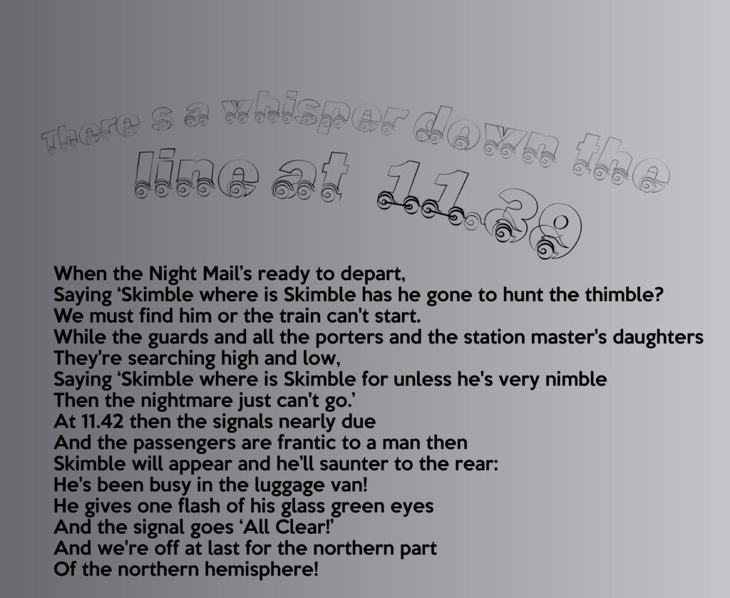
After lots of changing and fiddling about I have finally got to a place that I am fairly happy to leave this.
The train letter font I found fairly straight forward, but I seemed to struggle with the Typesetting poster part of the challenge. I have two designs both of which aren’t really resolved.
I spent a fair amount of time dropping my text into and around the cat silhouette, with not the best result. I didn’t have energy to individually place the letters, so was going with where Adobe placed it, and it didn’t look good.
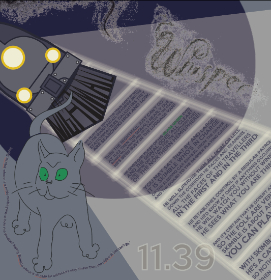
I eventually used the downloaded KEEP CALM font, with a shadow of a cat making some of the letters fade, plus the words night train in the shape of a steam train.
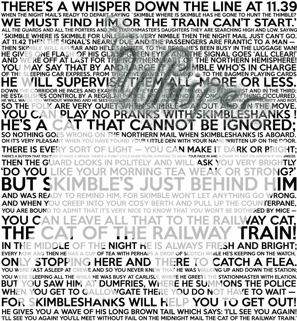
The lines on the full poem, however, are individually placed as the spaces between the lines didn’t look good. I was going to delete them from the cat shape, but when I adjusted the opacity of the cat, to see which words to delete, I decided to leave the transparent cat, I think it works with the words, as they are looking for the elusive cat.
I have adjusted the font page so it’s easier to read, although it does take away slightly from the first line being a carriage of trains.
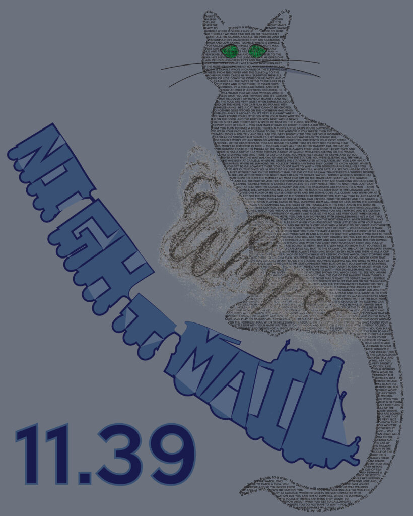
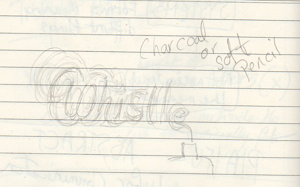
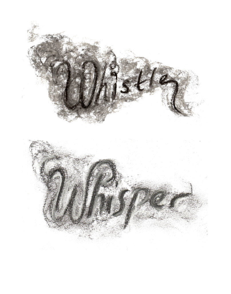
I was in two minds whether to include the charcoal Whisper, in the end I removed it.
The last couple of weeks I am starting to feel like I’m starting to run a bit empty, I think there are several contributing factors to this; 1, It’s been ten weeks of intensive challenge and thinking, and my brain and body feel like they need a rest. 2, It’s the school holidays, so my house if full of people, yes they let me get on, but there’s a fair bit of juggling others needs. 3, At work I am digitally restoring a 400 year old Senex horizon paper which is an awful lot of staring at a screen, so when I come to do this stuff I’m already maxed out with screen stuff, and my eyes start to hurt. The Senex was hand drawn which takes me back to the lecture, and how books, the bible and also maps were hand drawn.
I would have liked to have printed the night train with with either lino or screen, but time seems to be running away with me, much like the night train itself. I think it would have worked better physically printed.
Looking back at the original train outline I also think its better without so much around it, perhaps the blue background should be different, I was trying to get the feeling of ‘night time’ with the colour.
Perhaps my initial thoughts that a poems from cats would be ‘too much’ was correct, or perhaps I should have feline-d up the font as an easier option?
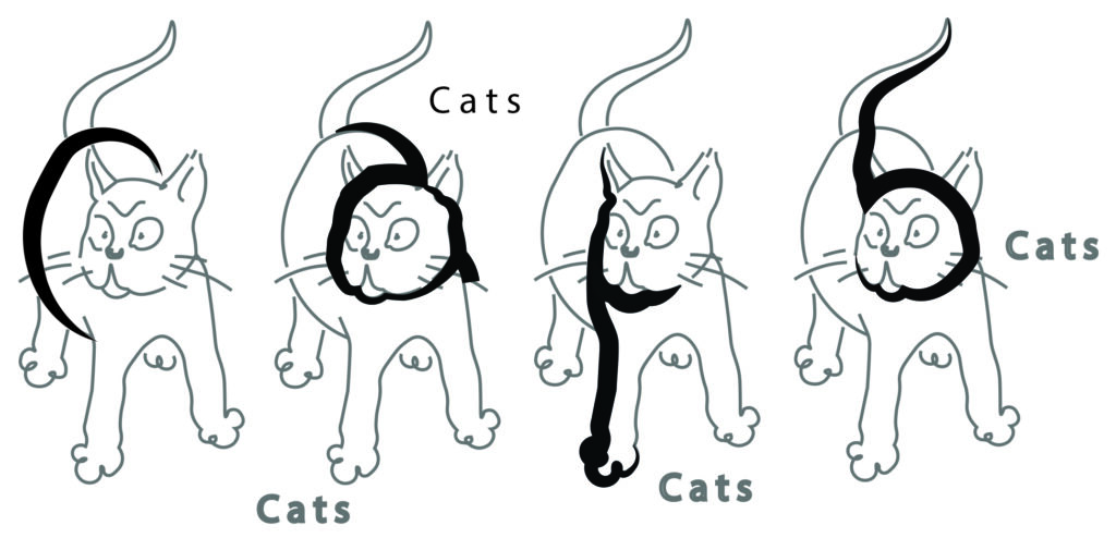
I think in hindsight I should have gone with my first idea of cat letters, but done it properly on a grid. I feel I flounced about with this and didn’t really get a grip on it. If I were to revisit I would approach it differently and hopefully not panic so much about the poem.
I decided to to take another quick look at this, I was able to secure some extra time due to my dyslexia, and whilst I have spent a lot of time making the PDF sound like it’s not written by a child, I wanted to also have another look at my worst week.
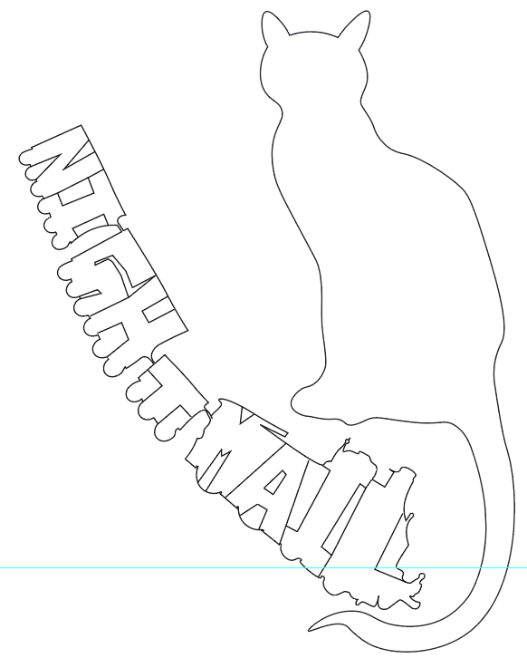
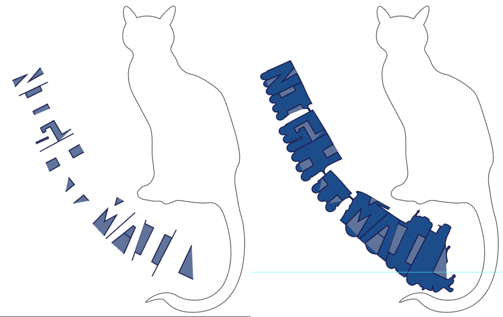
I decided to keep with the cats poem and try to get in to a happier place. Firstly I thought I would try the grid method, so looked at the original illustrations but Nicholas Bentley. I took the line drawing of the cat, and was going to attempt to make a font from the drawing. I did sort of do that, but putting it on a grid was a bit of a waste of time as I got distracted trying to find letters within the cats form.
I then decided to take the original cat illustration and put it into my badly composed type set page, I want to stick with the train theme but just make it work visually. I feel after a bit a fiddling about, and looking at it with fresh eyes it is getting there.
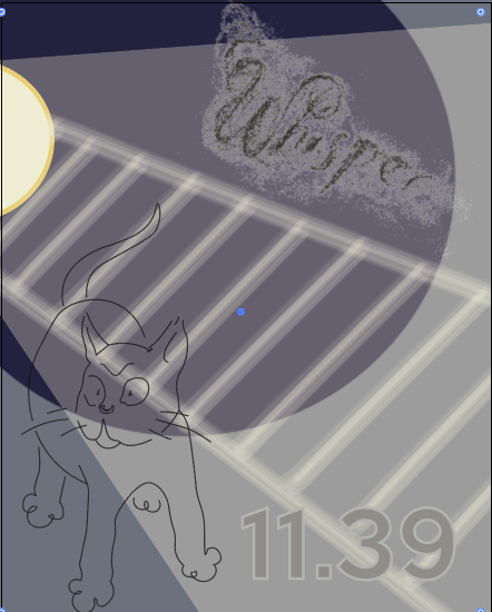
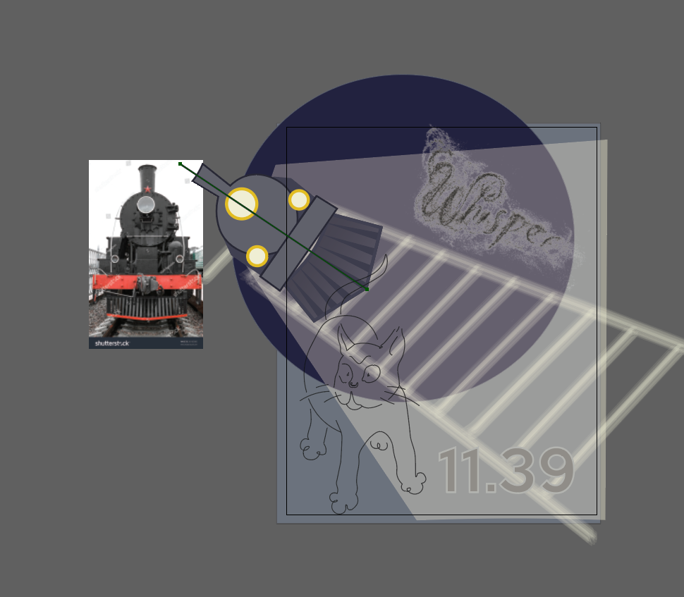
Using the steam train as reference; the whole train won’t be in the final design, but I need to draw it all to get the proportions right.

Getting there with it, I made the artboard bigger to incorporate more of the train now the train needs to look less like a card board cut out, and I think the cat could be a slightly different colour. I am also thinking of making the front grid of the train into the word nightmail.
Finally happy to leave it here, I think…
Théophile Alexandre Steinlen | Artnet
Second World War Posters: KS2 & KS3 Resource | IWM Learning Resources
Art Periods – A Detailed Look at the Art History Timeline (artincontext.org)
Nicolas Bentley, the Alphabet of Illustrators (fulltable.com)