I found this weeks lectures and reading materials incredibly interesting. I initially
listened/read whilst getting over a nasty attack of vertigo, so will re-visit again with a clear head. But from my horizontal vertiginous position I was able to pick up a few glimpses of what influences self, out identity and who we are. I was pretty amazed to learn there are no less than 450 words with the prefix of ‘self’. That our behaviour is determined by unconscious bias, and do we really have ‘free choice’? The thing that stuck with me was the New Consumerism ‘needs overshadowing desire’, making us want things new things to replace things that haven’t yet reached their shelf life. I personally think this is the scouge of modern society, and feel quite passionately about wanton waste and over consumption of finite resources. We don’t need to be doing it, and I hope there will be mass societal change.
My initial 20 words were also plucked from my vertigious state, between spells of room swim another would pop into my head. I have added a bit more now I’m thinking clearly.
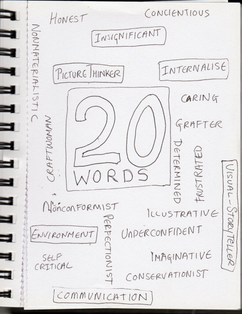
5 words and breif explanation;
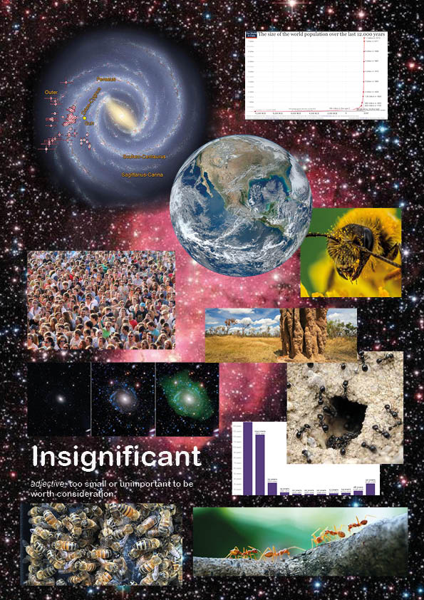
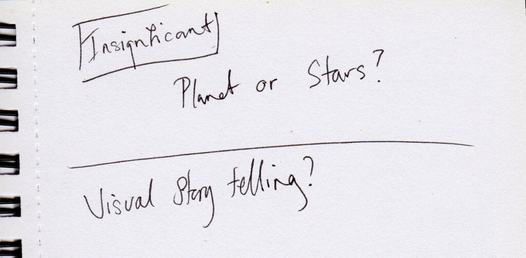
Insignificant, not to my immediate people, but as in an ant in a nest or a bee in a hive. In a population scale 1-8,000,000,000, about to extinct ourselves on the rock we call home, floating in a solar system in one galaxy of many, yes I’m insignificant
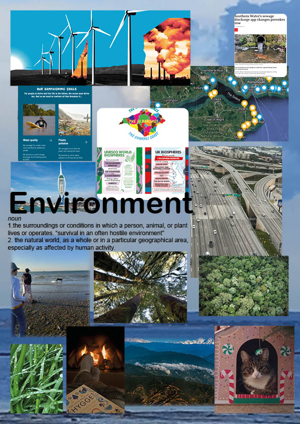
Environment, both immediate and wider environments are important to me, how we treat and look after our planet and nature concerns me greatly.
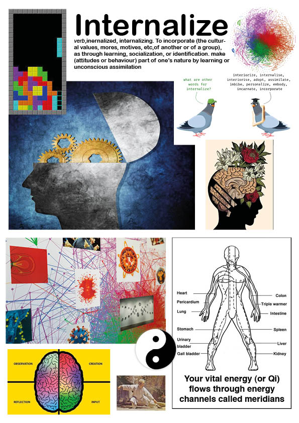
Internalise A word that come from my practice of Tai Chi and Qi gong, and flows into other areas of my life, to process and feel energy of the universe within. The overused Ying Yang symbol clearly demonstrates the flow of energy between opposites, heaven and earth, male and female, passivity and activity..
Picture Thinker, I am a visual spatial thinker and see pictures and images as my thoughts, I struggle to think in words and often get lost amongst them, ‘a picture is worth 1000 words’ (Fred R Barnard first used phrase in Printers Ink journal 1921), I just need to extract the pictures forming my head
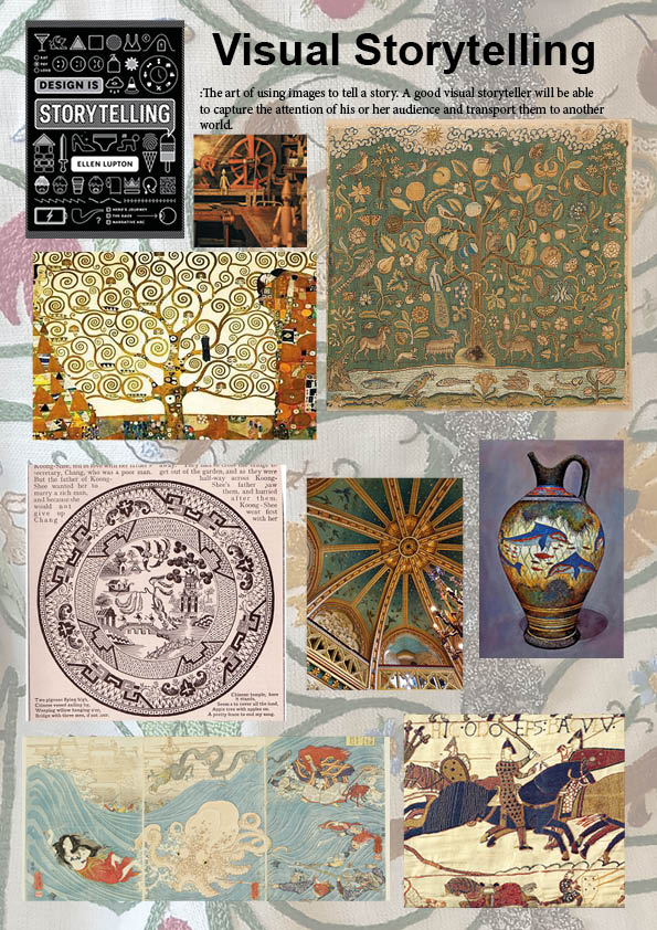
Visual Storyteller I like a narrative to what I create, a background, a story a reason, there are lots of historic artifacts with a visual story
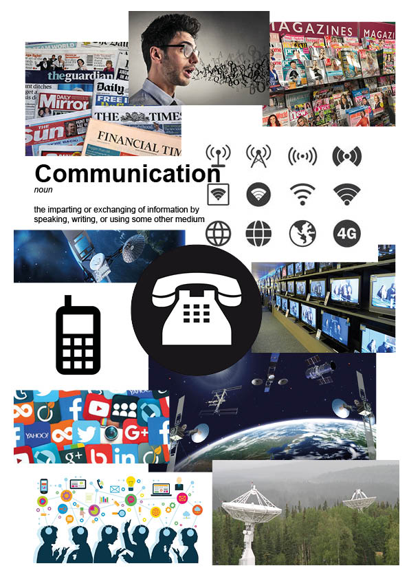
Communication, After some thought, and a late night revelation (!) I decided to go for communication rather than my initial choice of Picture Thinker, this is partly due to Picture Thinker coming in the same remit as internalize, and that I wanted something different to focus on, but also because communication is an important part of design and society today.
Initially I thought the final piece would be a digital outcome, but once again after the workshop unpacked I had different thoughts and have been considering what I can make. I am quite looking forward to this!
I think I want my outcome to be multi layered, I thought about materials and considered, appliqué with fabric, clay relief tile, cardboard relief. I will probably go for mixed media.
I have decided to take an element of each mood board and combine into a ‘thing’. It will probably just be a decorative object, but I’ll see if I can find a use for it 🙂
Help, my sketch book is falling apart.
Initial ideas for ‘thing‘
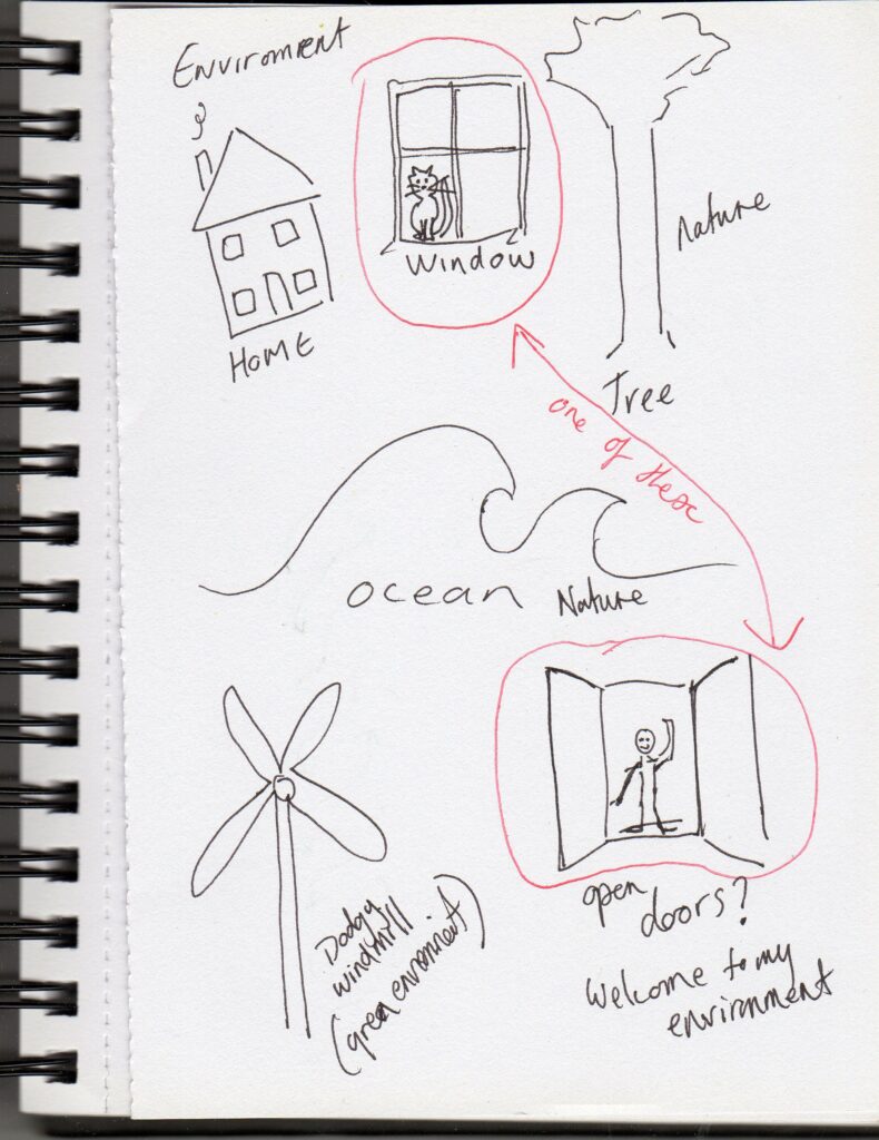
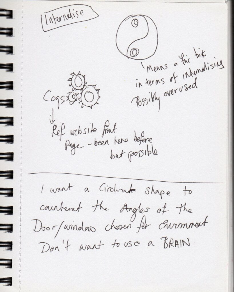
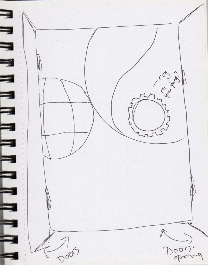
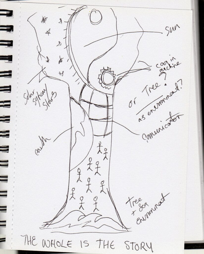
I found the door shape too rectangle, and want something more from the natural environment, so have gone for a tree shape, which also incorporates the tree of life from my storytelling board.
And now to make it look like something 😉
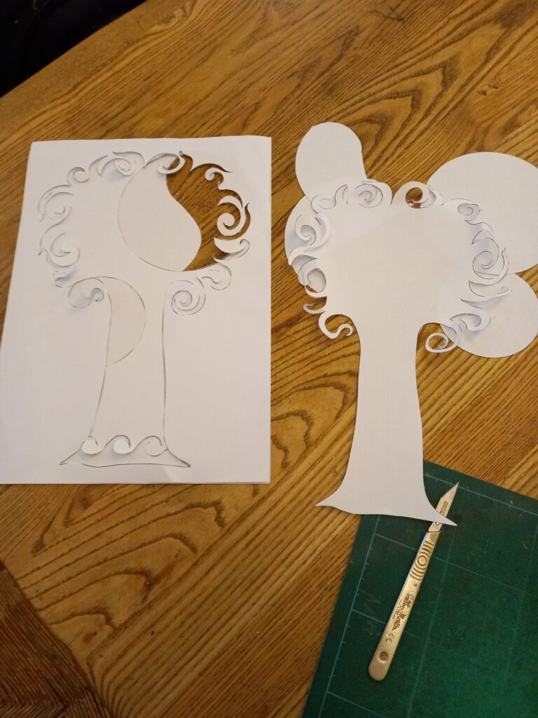
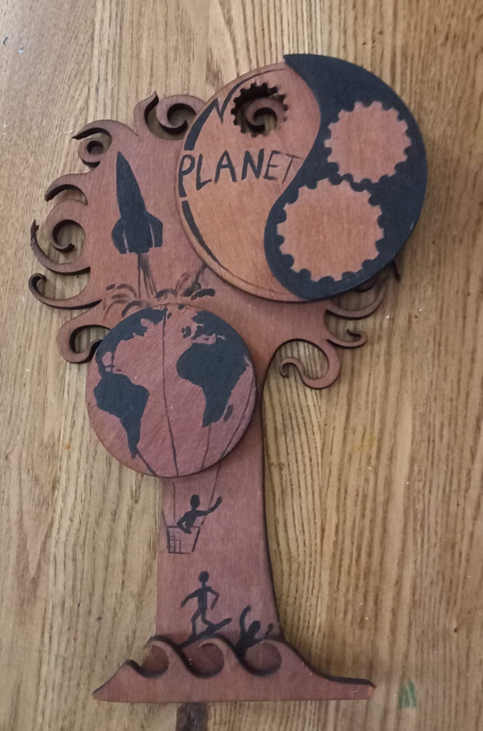
Paper prototype, now thinking I may also do something with the negative bits when I cut them.
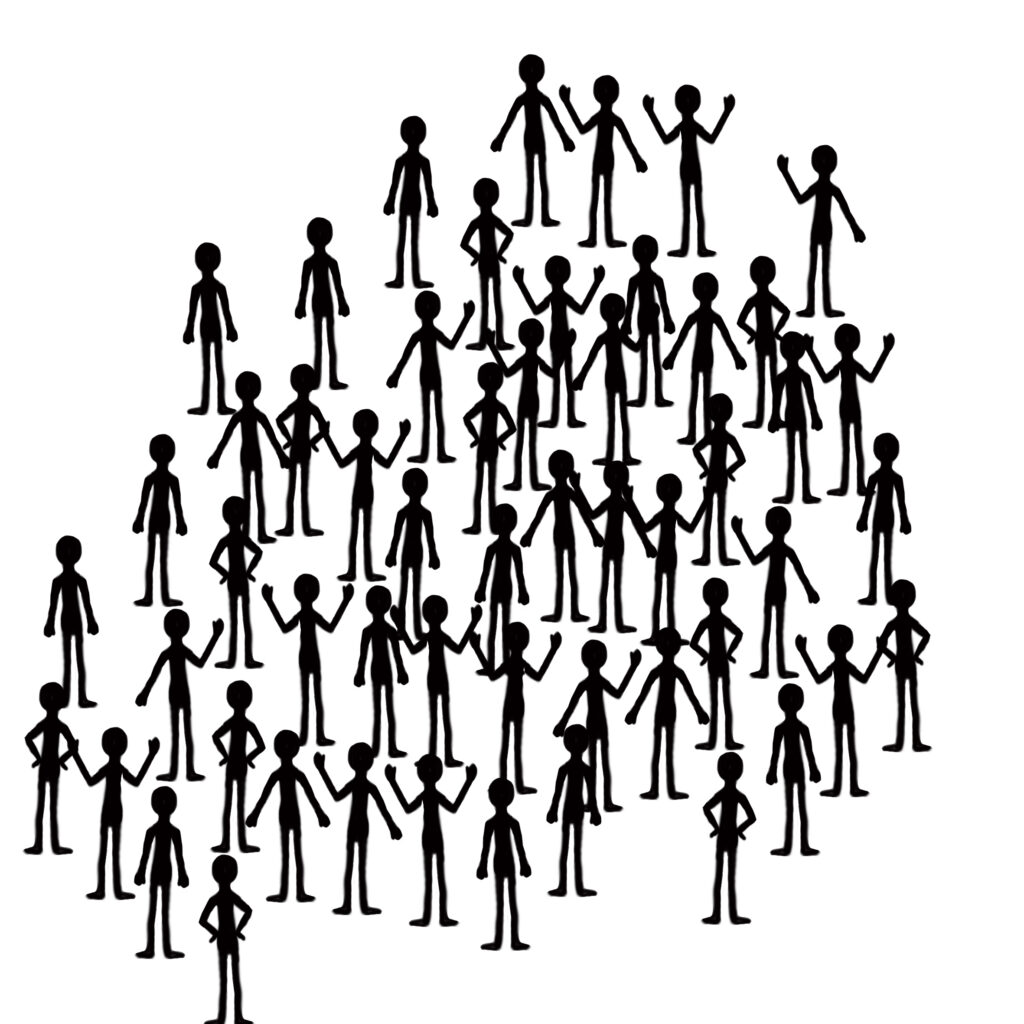
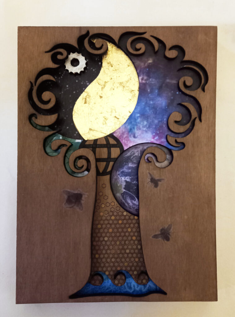
Overnight I have decide to ditch the stick men and go for a honeycomb pattern, I think it will be more in keeping with the rest of the design and incorporates, Environment, Insignificant and Communication.
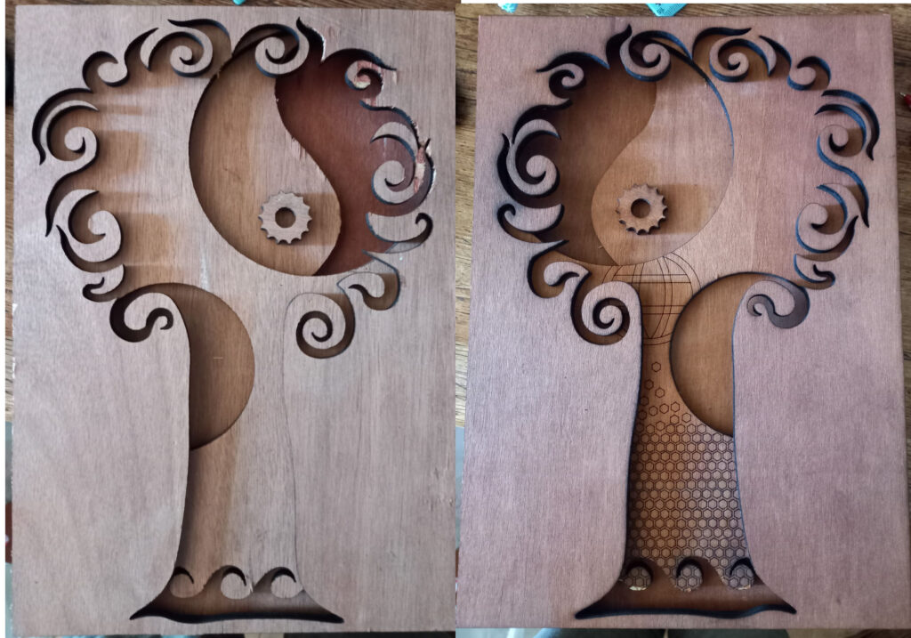
I asked at work if I could cut my work on the laser, I was quite pleased when the answer was yes. I kind of expected my boss to know what he was doing with it, but it turned into a bit of a struggle. For some reason it cut in mirror image. It took a fair amount of time and wasn’t too great at cutting through the reclaimed ply that I wanted to use. I had to finish of with a scalpel as it didn’t quite cut through, and I didn’t want to ask to do yet another cut. This left the reverse, and my inverse shapes a little worse for wear. I guess this is the thing with experimenting with new materials. I didn’t feel in a position to ask to do it again so will probably go with the reverse image, as it has the engraving and the edges are neater.
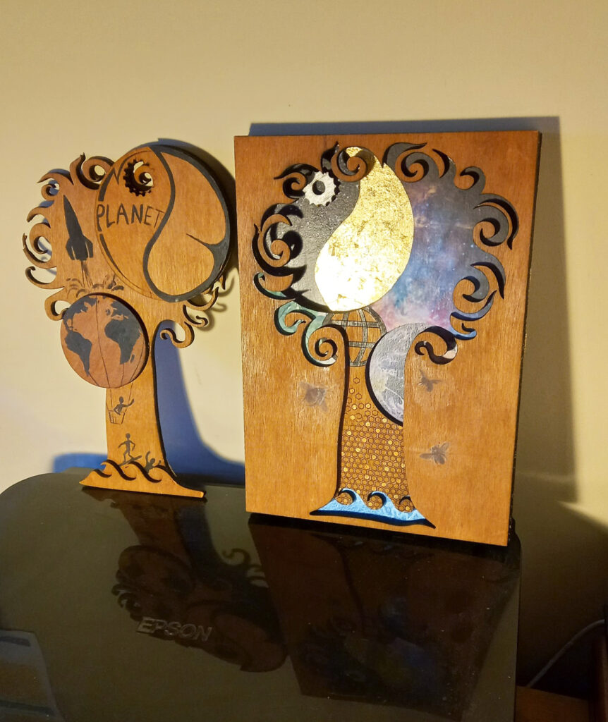
The one on the left is kind of what was in my head when I started, the one on the right is the tangent that happened with the negative cut out pieces. It’s tricky to photo well with the layers of ply- I am disappointed with the photos, and may try again with better lighting and a camera rather than my phone. I will upload pictures of separate layers of ply and the process when I do the PDF
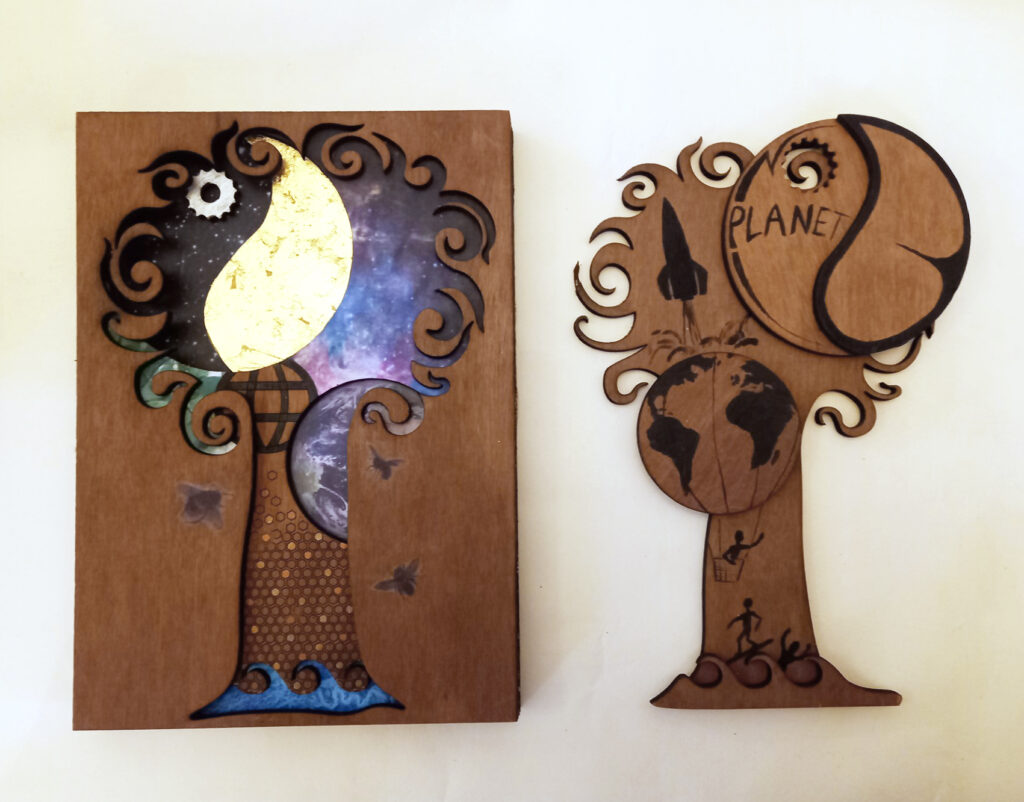
The first one is a combination of digital, with decoupage of images from NASA, plus the bees from a dover book, gilding and paint, the second is digital (for the laser cut out) and paint. I think I’ve made a puzzle because one fits well inside the other.
I enjoyed this task, particularly being able to physically make something- It didn’t turn out quite as expected, but things never do. I think it looks ok, but I’m not overly happy with it, I now am thinking of it as a prototype, and if I was to make another would use different materials, the ply was really difficult to cut. Some of the NASA images I replaced along the way as they were too bright. The bees were an afterthought, and didn’t print as well as anticipated, I have used printable tissue before for both decoupage and repairing antique globes, the decoupage I did before was of a clearer larger image, and the globes have background coming through the paper which means the tissue blends a bit better with the background. The bees were probably too small and detailed to use this method, and should probably have been cut with the laser.
It was a bit of a bonus having the negative spaces to work on, initially I was going to give it the same treatment as the cut out, but decided on just black paint so it would contrast a bit and be opposites- initially (according to my daughter, and she was right) the rocket looked like a bottle of wine, so even though I’d used an actual rocket image for reference, I changed it to look more like a ‘standard’ rocket. My painting style is quite different to printed matter- being quite cartoony. I think looking at the photos I actually prefer the second piece because it is simpler and a bit fun.
I also look back at the raw cut ply, and think – should I have jt left it like that?
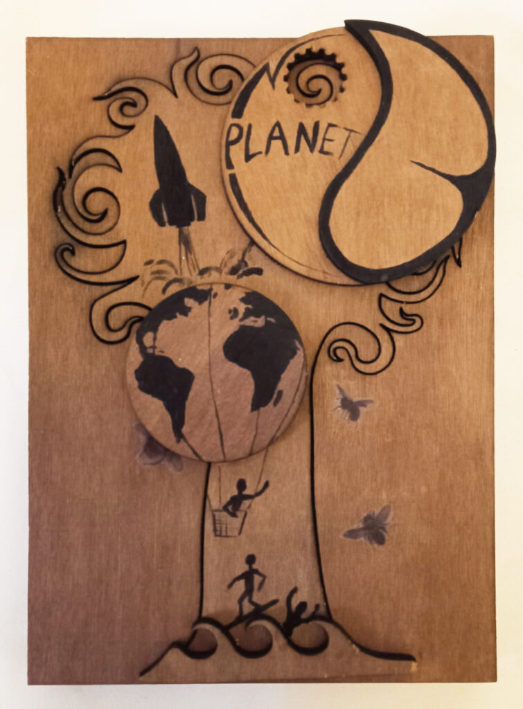
I am now thinking the B looks like bum (butt) cheeks, so have to amend it
I look at the object and I now think I could have made it more useful, initially I thought it would be a kind of 3d picture to have on the wall. It could have had some more layers of ply, and a protective layer of Perspex and been made into a useful box to store things in.