To me this brief has echoes of week six: noticing the ignored. To find an emotion that fits my town is quite a tricky task. I have started with a few words that describe the town and will hopefully come up with an emotion. I would like to add that, the like noticing the ignored brief, the town will have different emotions at different points in time, weekend evening will have different vibe, or emotion, to Monday morning.
Different areas have different feelings, in the high street there are a few chains, mountain warehouse, boots peacocks the works, several empty shops and charity shops, like many regional towns it has a downtrodden slightly depressing feel to it. However on that stretch virtually opposite one another are the Veterans Lounge and Aspire; The Veterans lounge is a CIC to support veterans and serving personnel, and their families with an island connection, both emotionally and financially.
Aspire is a community hub and creative space for workshops for people to learn new skills, they also provide mental health support, craft groups, as well as their ‘charity shop’ offer. It is a more central branch of the Aspire hub, an abandoned church building that has been put to good use to provide much needed food bank, cycle workshops men (and women) in sheds, to name a few of their offerings.
Union Street, 2 minutes down the hill has an altogether different vibe. Busy pubs and restaurants, independent shops a buzzy vibe with tourists and islanders spending and having fun.
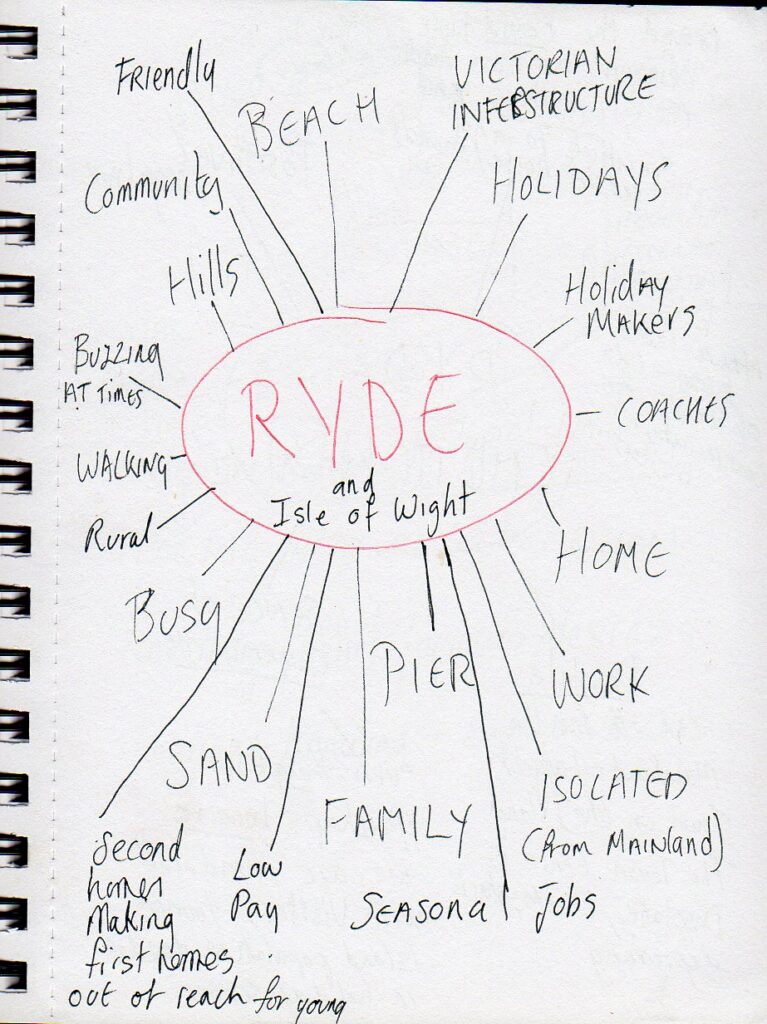
Words that describe Ryde, followed by emotions that I feel in Ryde. The emotions list take a lot more of my brain cells.
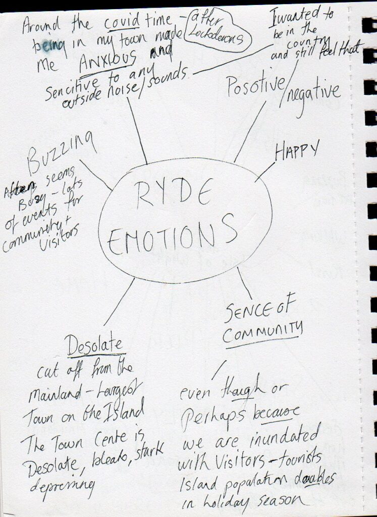
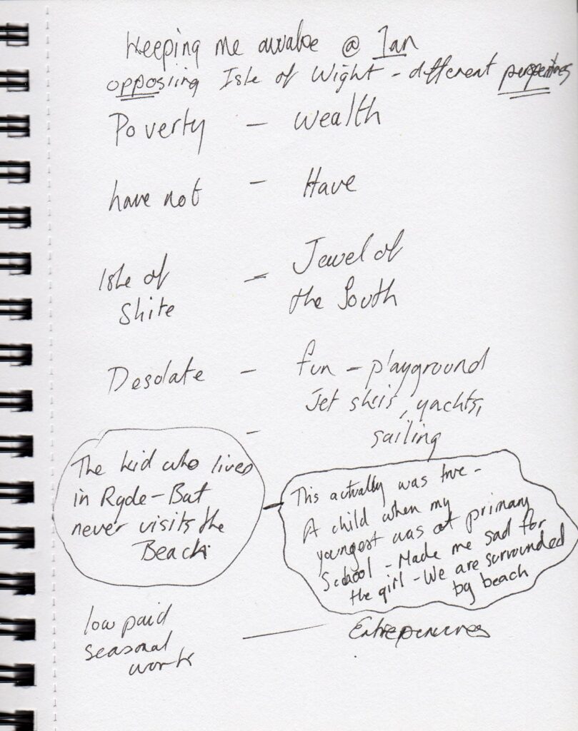
It is very difficult to just choose one emotion, so I shall choose two opposing emotions.
DESOLATE and OPTIMISTIC
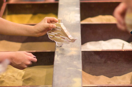
I am thinking of making the word RYDE out of sand and beach find, similar to the Alum Bay Needles sand souvenirs. It is a somewhat tacky, but popular attraction with roots in the Victorian era some 18 miles from Ryde, but still on the Island, so geographically the same area. Fill a plastic shape with a variety of different sands, for a stripy take home thing you’ve kind of done yourself.
But rather than be the pristine sands of Alum bay I will locate what I can on the beaches around Ryde and attempt to create the word RYDE in both a desolate and optimistic way. Hopefully 3D, or possibly more a collage, depending how successful I am at mould making! Clay, sand, stones, plastics, glass who knows what the tide will bring in? I will hopefully have time to embellish it.
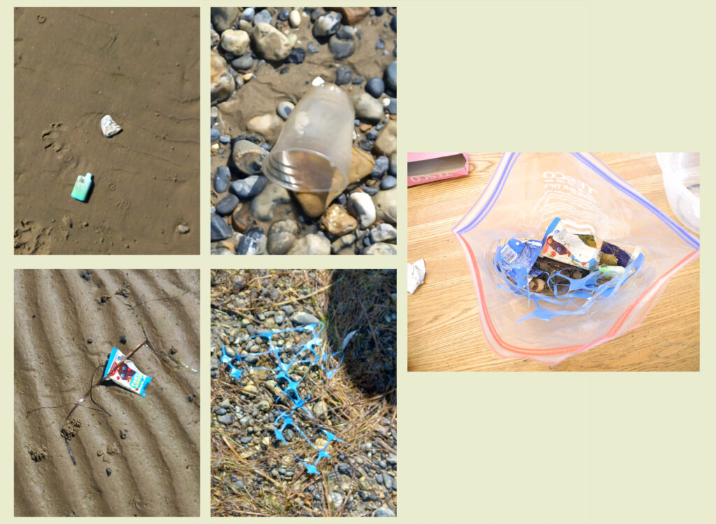
The touristy bit of beach is usually kept pretty clean, sand stones shells etc, all nice and clean; the less touristy beach, where the dog gets walked ,usually has more interesting finds.
Plasticine mould, wooden mould, cardboard mould, acetate mould?
Change of plan..a differnt idea
As I thought of making a mould, and whilst walking dog, it occurred to me to make the structure of the letters from casting plaster, rather than fill a mould or vessel with sand and other beach stuff, this is more in keeping with my immediate locality of Ryde, the fine Victorian buildings with their castings and ‘original features’. The optimism of a bygone era still present today, and the beach stuff (finds, rubbish, litter) to represent the desolate.
I am considering adding some natural beach materials; clay and sand, but I think this could be purely aesthetic. Although I suppose the natural environments in Ryde can still be both desolate and optimistic, and if I’m getting the desolate litter from the beach, they why not a bit of the optimistic natural material too?
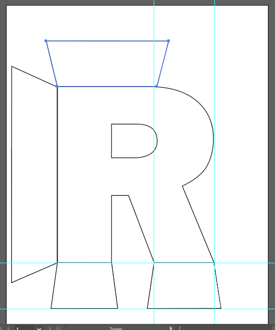
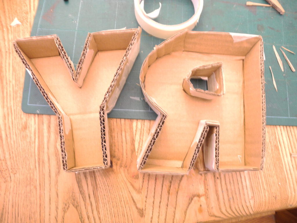
I have looked through a few fonts to use as a template base for my mould. I have decided to make the mould from cardboard, lined with either acetate sheets, or some other flat plastic; stuff I have at home. (Edit; Clingfilm or tinfoil if I use the plasticine) So I need my lettering to be as simple as possible to enable me to make it our of card. I have narrowed it down to; Centaury Gothic Bold and Franklin Gothic Heavy
Both have fairly straight lines and are sold.
Although I like the slightly more elegant Century Gothic, I have decided to go with the Franklin, as there will be more surface area for me to dump the detritus of the desolate.
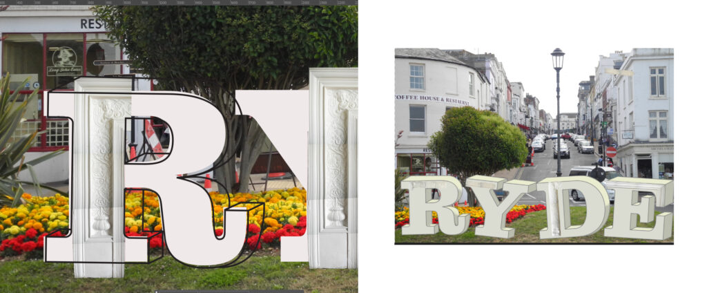
The challenge unpacked has really got me thinking about the scale of my word RYDE. Obviously I will be making it quite small, a mini prototype- however I now can envision this at the end of the pier, welcoming people off the Fastcat, perhaps around 6-8ft high- Making it this size would enable me to add actual Victorian style castings to it and more of the beachy bits, sometimes you can find whole and broken shoes, footballs (both intact and deflated), old barbeques and bottles, drinks cans, swimwear and socks, buckets- anything the tide washes in or people can’t be bothered to take home after their fun on the beach, leaving it feeling ‘desolate’ and uncared for. Being made of cast plaster the weather would soon add its touch and start corroding the word, adding to the desolation element.
I may also have a go at a bit of plasticine relief, which would represent the castings that would be on the full size version, perhaps the word welcome? Or maybe cut the word from more card. EDIT, my cardboard moulds are far too small to add plastercine releif.
Now wondering if I have to make it a physical object at all? But I think that will be the fun part.
The reason I want to use as simple text as possible if making out of card. The template for the mould. If making full size a different font could be used, I quite like the solidness of Franklin.
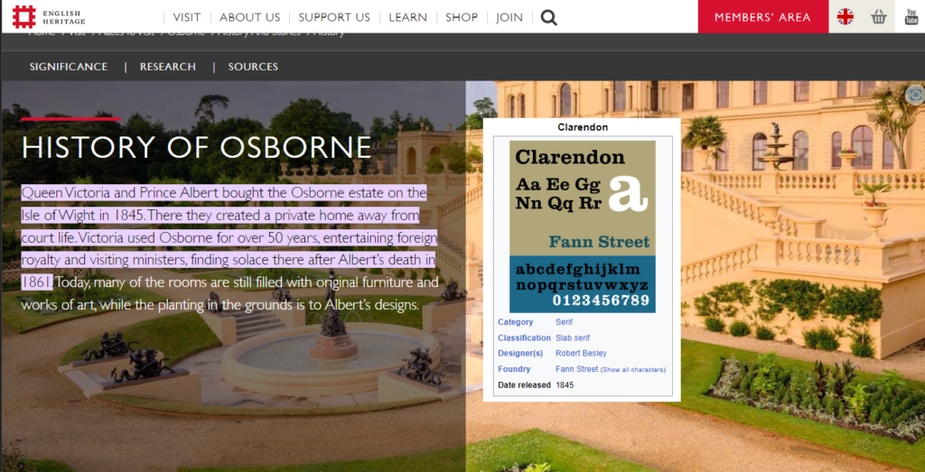
If this were to be made full size I would most probably use Clarendon, released the same year that Victoria moved to the Island, bringing wealth and optimism.
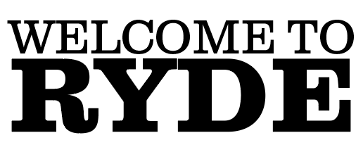
I’ve downloaded the Adobe version of Clarendon to use for my mock up.
The small prototype, I realise making these from card that every wrinkle and fold seen in the card. or whatever I use to waterproof it, will also show up in the plaster. If this was to be made large scale I think the mould would have to be some kind of latex, fibreglass, or perhaps a wooden mould that could be dismantled once the plaster has set.
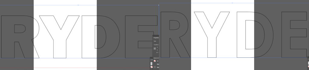
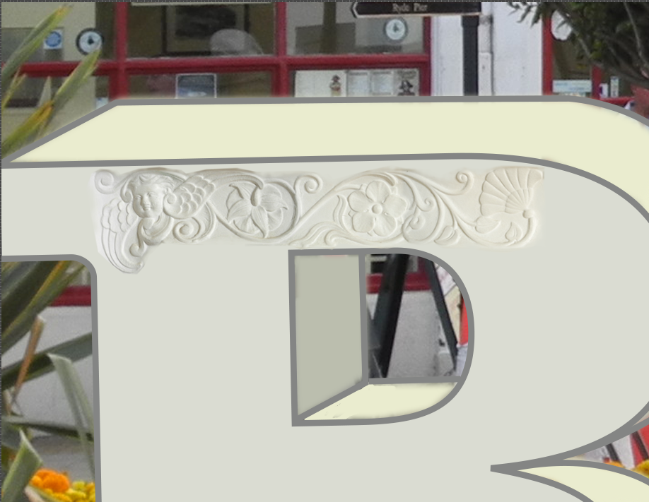
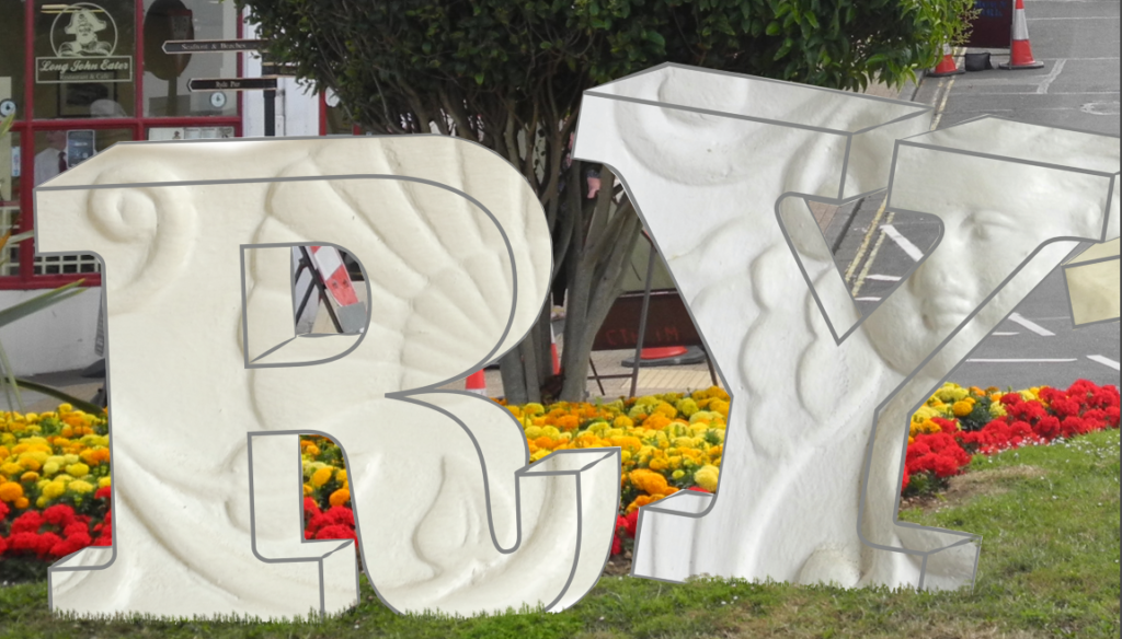
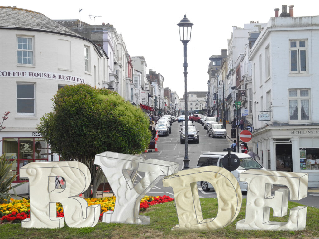
I have started a photoshop rendition of the word RYDE placed on the roundabout at the bottom of the pier. Getting the castings to look ok has been a bit of a headache, so I decided to just blow them up large scale and I think it works a lot better.
The Illustrator 1pt line around the lettering isn’t great, its too neat and too uniform for the effect I require. Illustrator isn’t allowing me to change the line on the pre-set font. If I had time I would redraw the outline of each letter and choose one of the more organic looking lines. It could well be this very straight line that is making my smaller areas of casting look off- a combination of both factors.
A five minute scout around the beach provided this little lot, so plenty to try with my small letters to see if it will work, a lot of the pieces I found were too big from my small prototype, but would be ideal for a large scale version.
The letters have been filled with tinfoil to create a barrier between the card and the plaster, and then filled with small beach stuff. I hope it works.
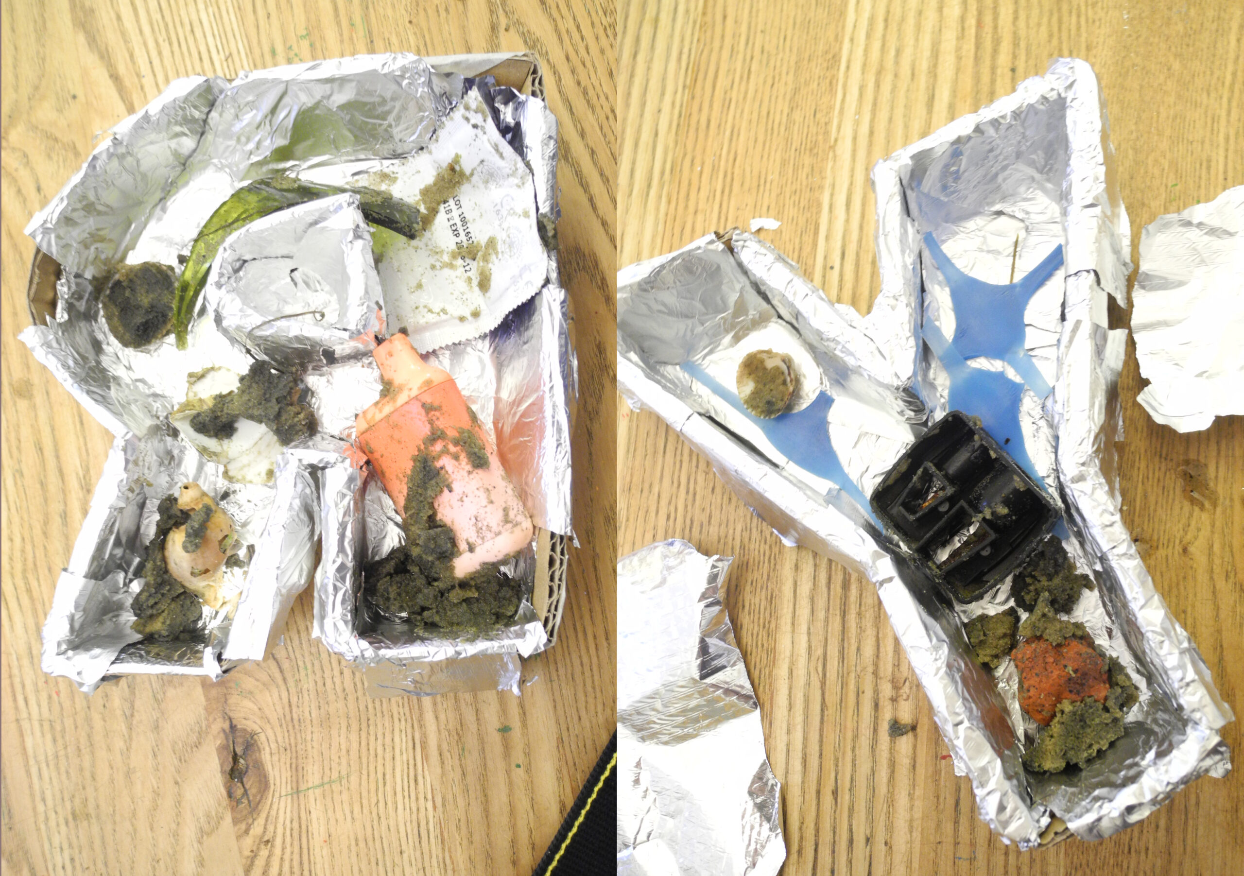
It didn’t go quite as planned. The tin foil wasn’t the best barrier, the plaster lifted the objects up and seeped underneath so I had to scrape away some of the plaster to see the objects. I notice that the areas of sand are still crumbly, the plaster didn’t seep in, so if I were to do it again I would line the bottom of the mould with a thin layer of sand, push the objects half way in and then pour the plaster.
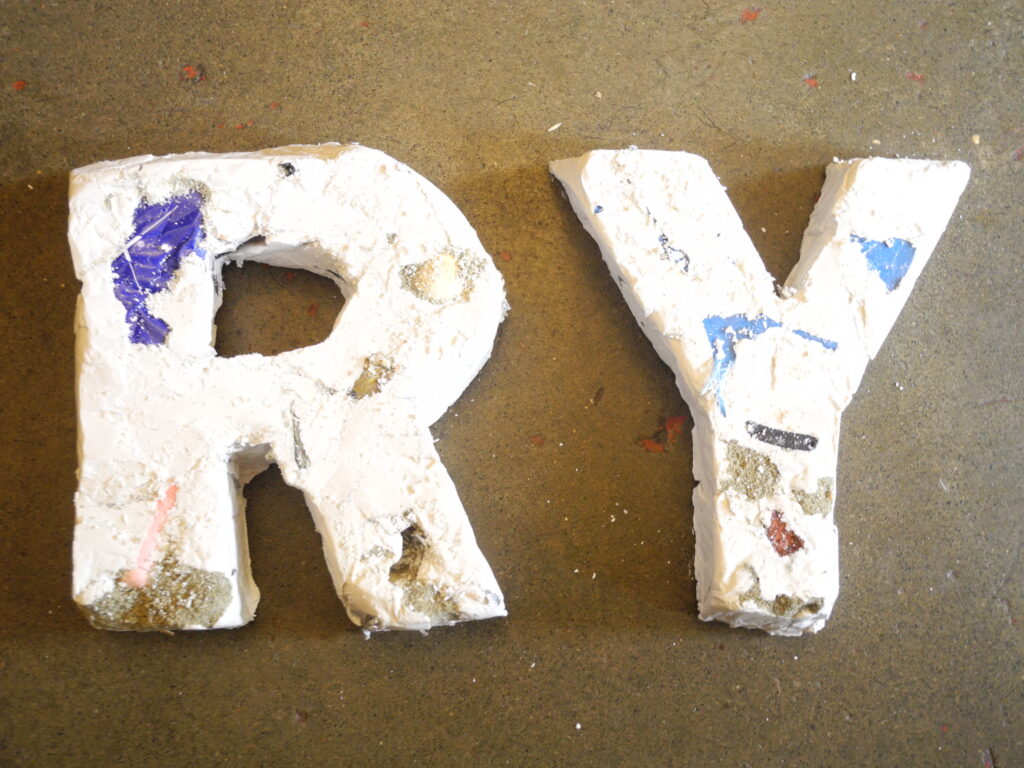
Out of time and out of energy; this is as good as it will get
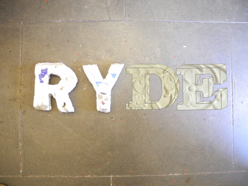
Plaster letters with digital letters
In situ at the end of the pier (just the optimistic letters, with a slight crumbling) Having returned from a visit to one of the local mainland cities, I returned to Ryde feeling far more optimistic about the place than when the brief began. Stepping away, for just one day, made me look at the place with fresher, less jaded eyes. Yes there are desolate areas, but on the whole its a good happy and optimistic place.
Clarendon (typeface) – Wikipedia
Emotion | Definition, Examples, Scope, Structures, & Facts | Britannica