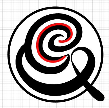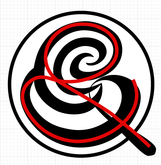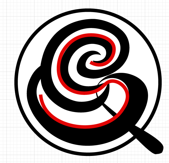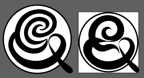
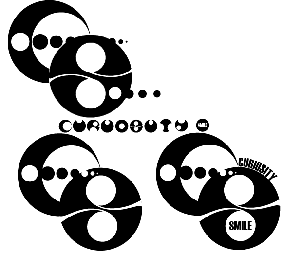
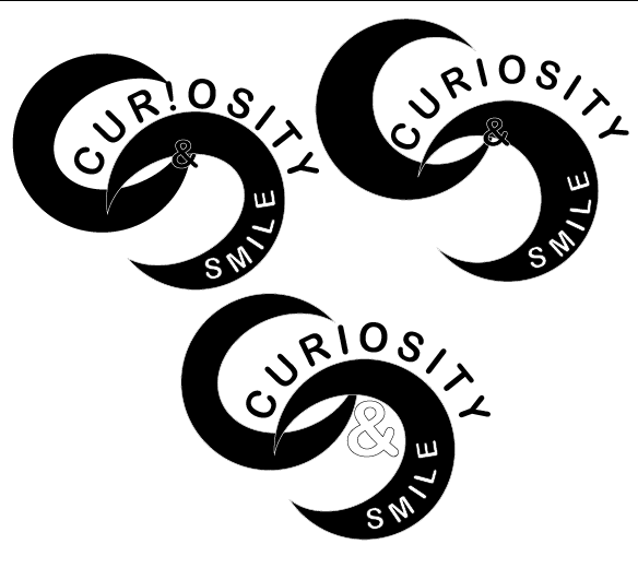
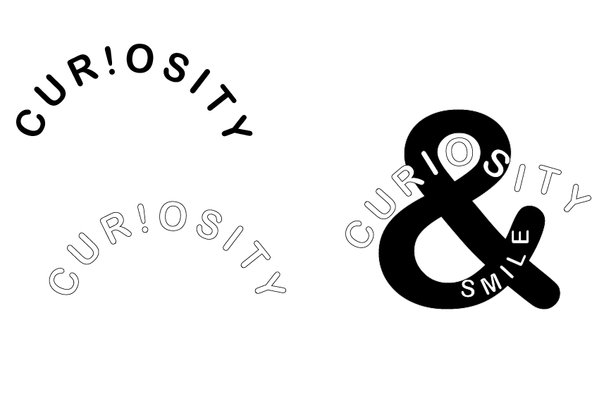
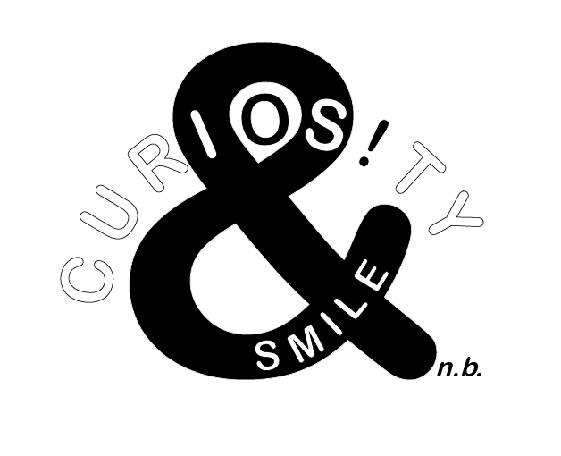
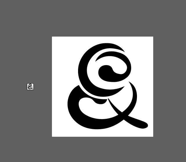
I spent a fair amount of time trying to form a logo for my business, and never being happy with it. Initially I thought of making it a face, but that was very ugly. I thought about the …. that sally had suggestion on the ideas wall, and started fitting the name curiosity and smile into circles. It worked ok, but I didn’t feel it was compact enough. I then started looking at the ‘&’ and how to fit the ‘C’ from curiosity and the ‘S’ from simile so that it was a bit of an optical illusion as to which you would see.
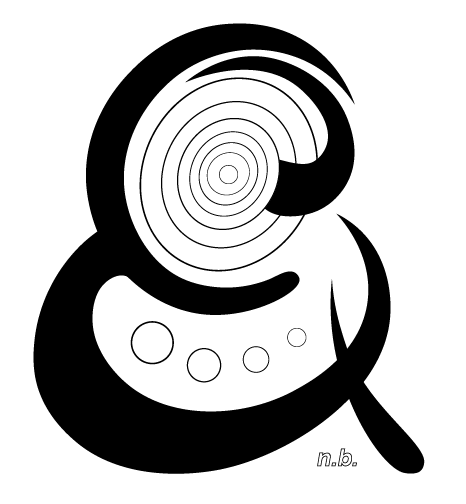
I added the number of dots and rings to account for the number of letters in each if the words, but after the second group crit Teressa pointed out scaling and things getting lost so I had a rethink. I spoke to Joel, whose idea for my business logo was great, and worked but was not my idea and I didn’t feel it quite fitted with my visual identity
?-) turned on its side.
Too big, smiley and not not ambiguous enough for me.
Back to the middle
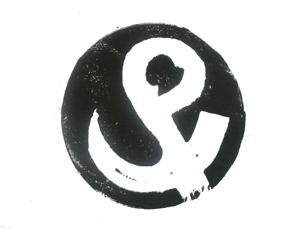
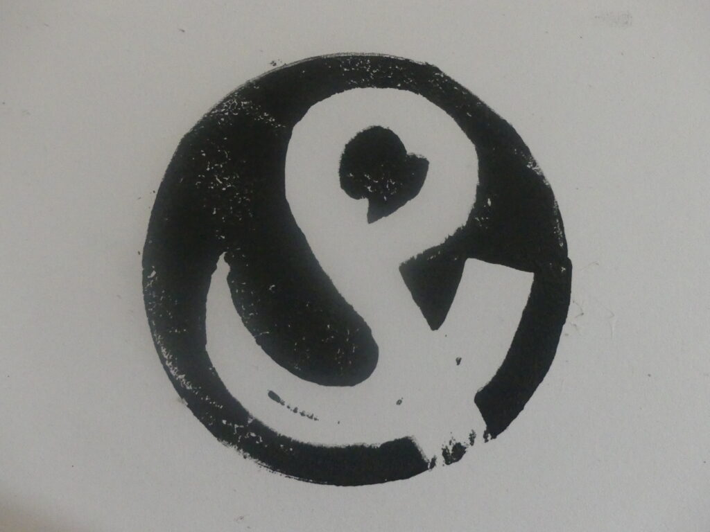
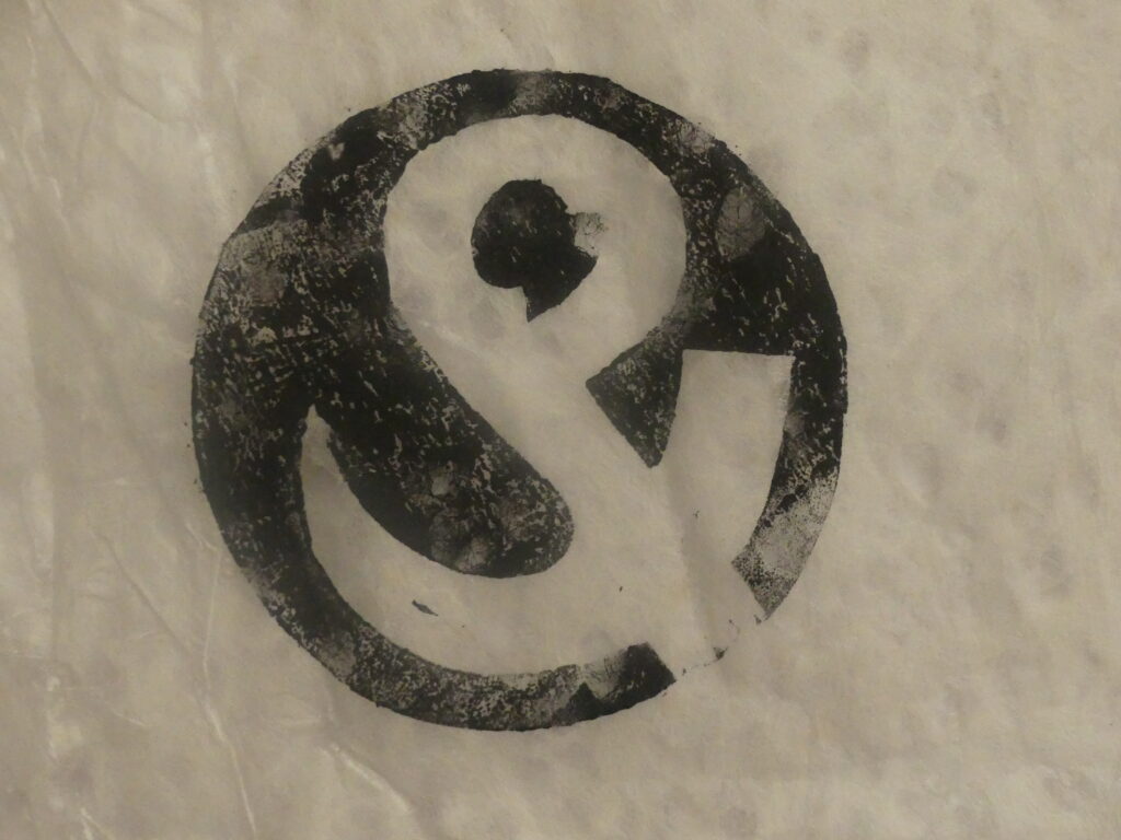
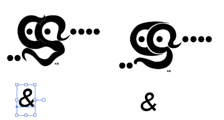
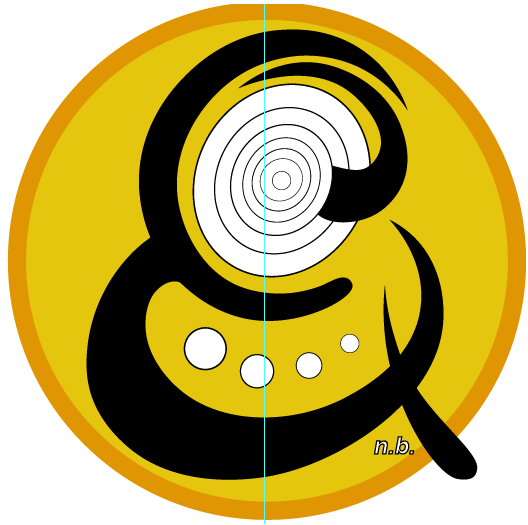
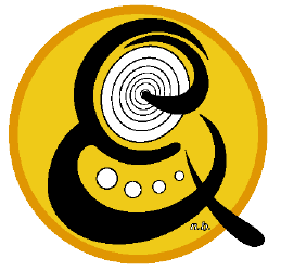
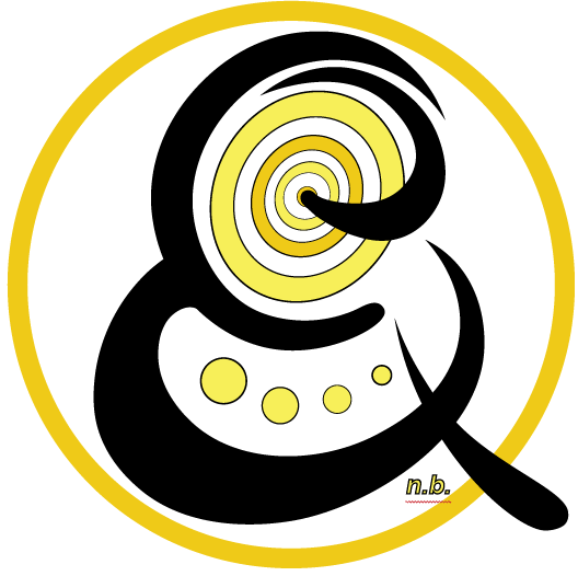
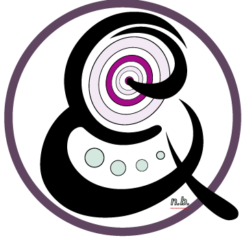
I went back to the idea I had of the ‘C’ and the ‘S’ hidden within the &. I swapped the top curve of the ‘S’ with the ‘C’ which I felt worked much better with the ‘C’ within the ‘S’.
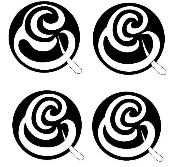
I simplified and started putting the design in inverse to try to get the balance of black and white right. I feel this is something I could work for hours on and still keep going back and tweeking it. I think this is partly down to me being so close to it that it makes it difficult to happily conclude, and partly because I just found it a really difficult task, with it never quite appearing on the screen as it does in my head.
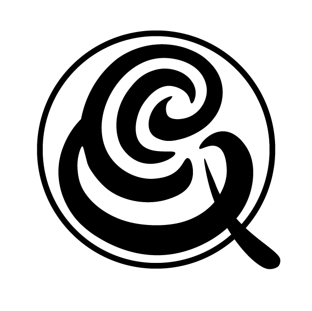
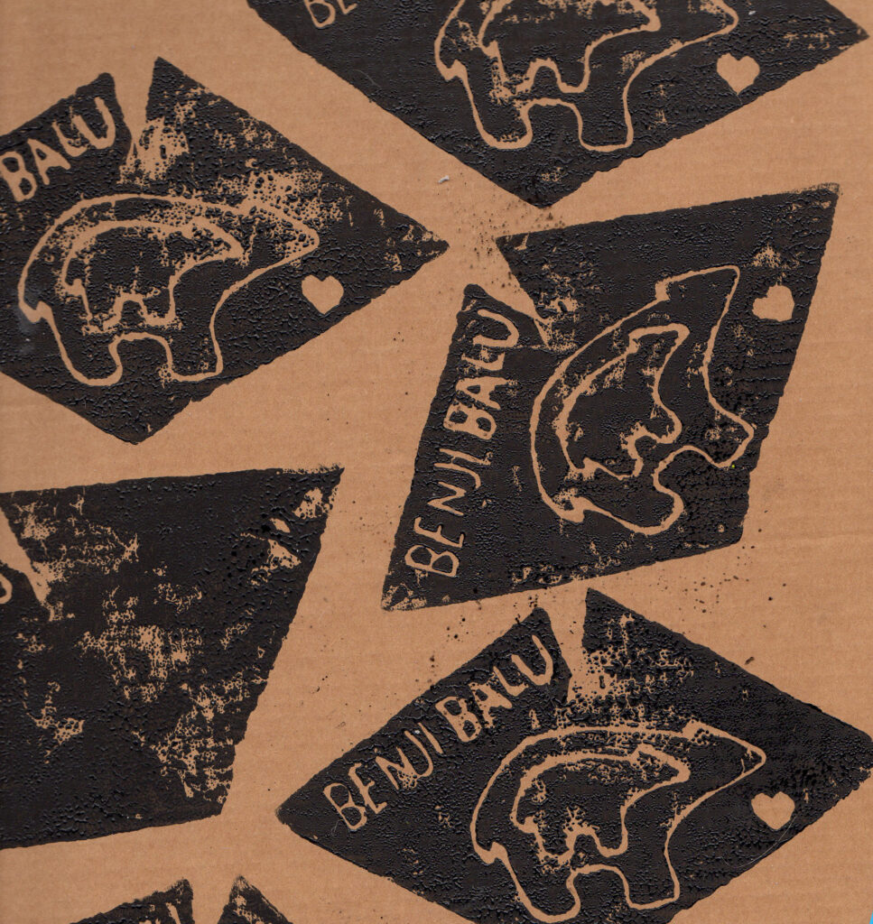
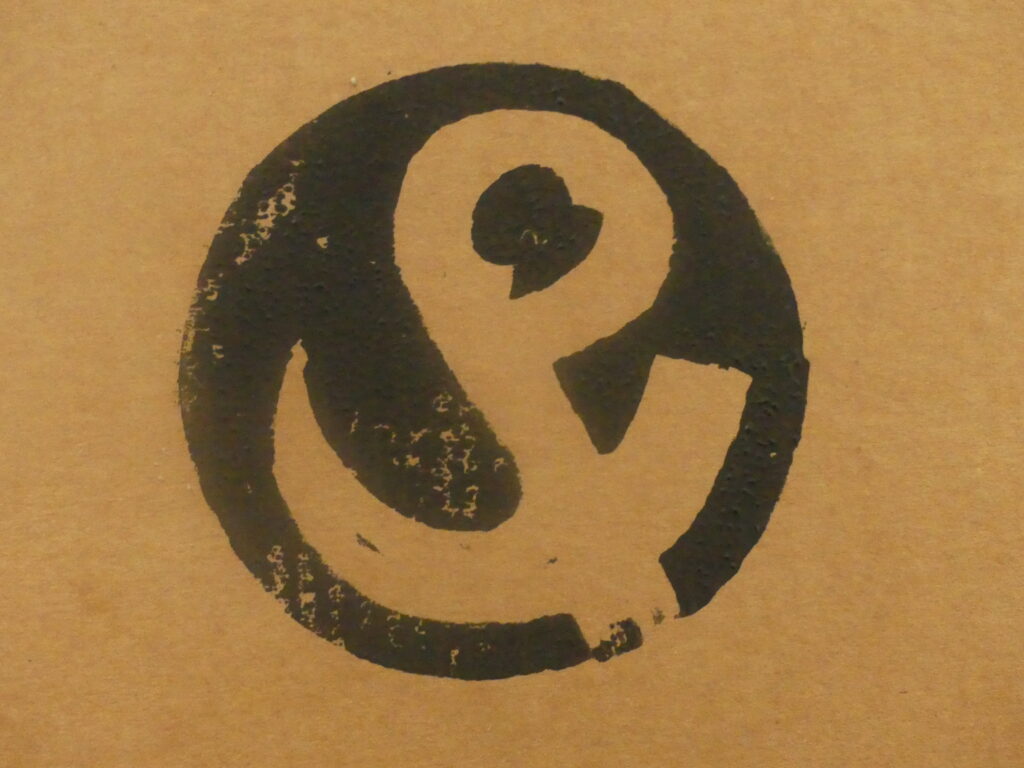
Playing with lino, and I think I have the answer to my logo issues
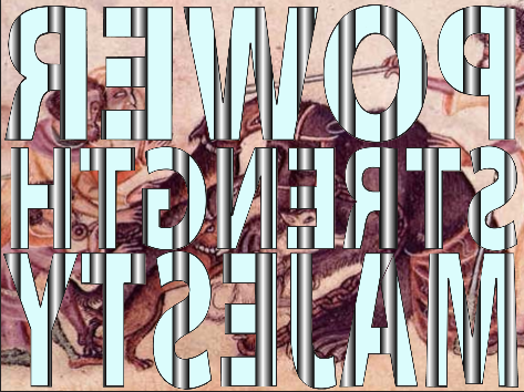
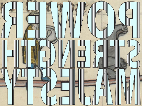
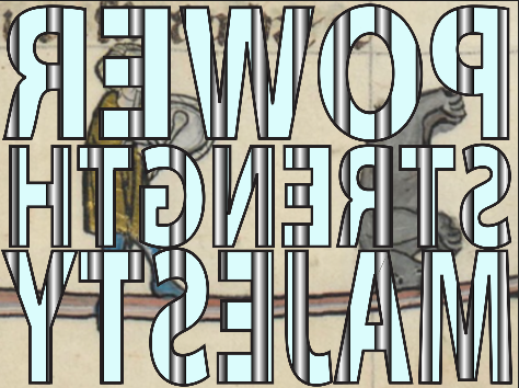
Trying to find a better image for the inside of the cage using historic images of bears. The most impactful images were the Chauvet paintings giving the inside of the installation a more oppressive and cage like feeling. It would be great to have some high res images of these photos, but unfortunately that’s not possible for this project.
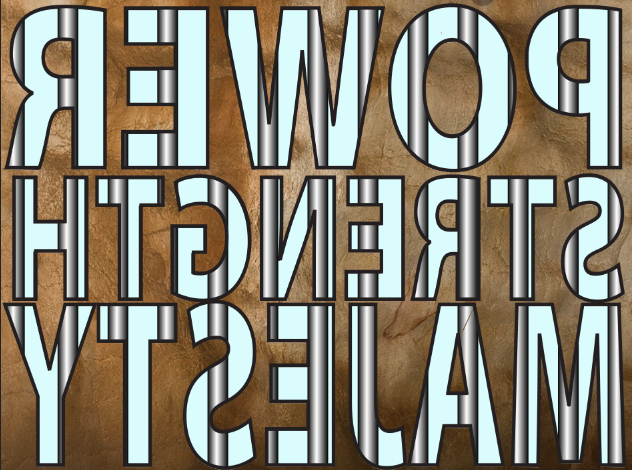
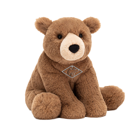
With nine days to go I dropped the bear mascot idea. It wasn’t working particularly well with the rest of the project, didn’t add anything and has been done many times before.
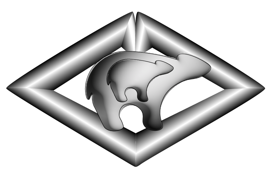
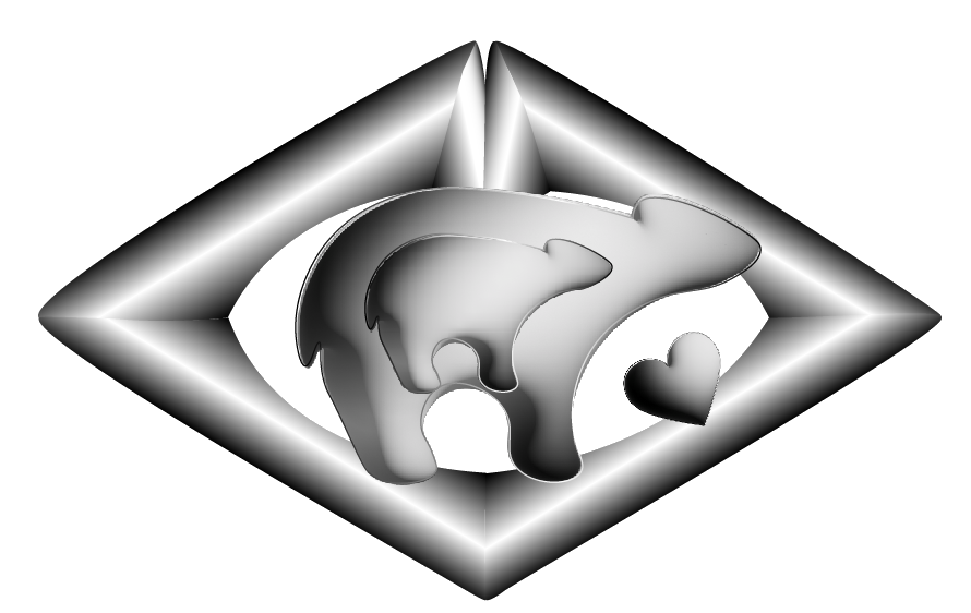
Above, lion cut of logo, it works a bit better but in lino, but has given me some ideas on what to change.
And sometimes when it just isn’t working it’s best to start again. Taking out the over complication and beginning to look more elegant.