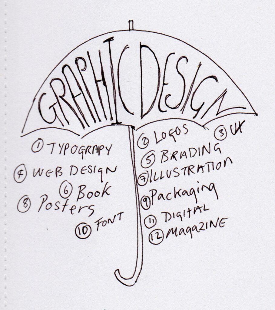
10 different types of design practice today
Breaking the definition of design practice
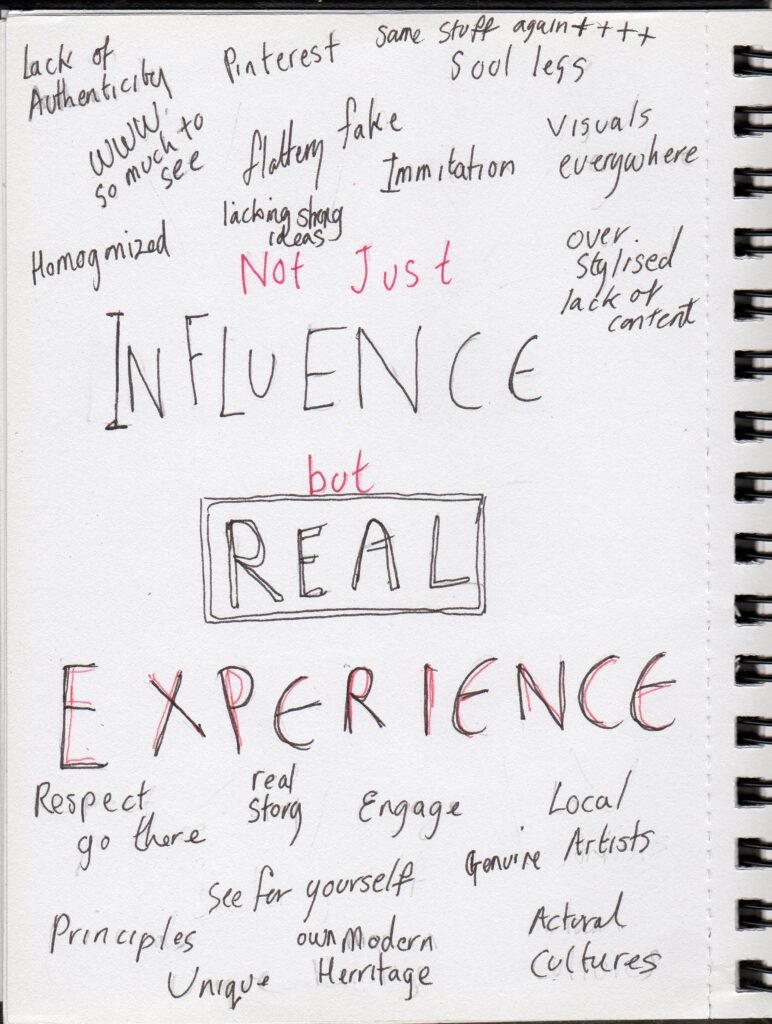
I have/am really struggled with this week’s task so will upload what I initially thought is to be as well as what I understand it to be from the challenge unpacked webnair. I am suspecting that neither quite hit the mark. I am also struggling with finding something that crosses the boundaries, I find the definition ‘boundaries’ a bit arbitrary, are there still rules and boundaries to be broken? Watching the reference films it looks like many rules have already been broken and anything goes, as long as it is carefully thought out and the initial problem is addressed.
Boundaries of Graphic Design#1
Blurred boundaries, this phrase has come up a lot in the past few weeks- Blurring boundaries as I understand it is not only the boundaries of what the graphic designer does, but the outcome can also have boundaries that blur.
From the past few weeks I have learnt some of the great scope of things that come under the term Graphic design, it seems to me that there are no boundaries, only the limitation is of creativity and ideas. It uses elements of photography, film, illustration, art and many elements of life to create a visually interesting and exciting idea. Mentioned several times in the past few weeks has been an ‘accident’. I love the idea of a design accident, that something happens and it’s end use is different to intended, or is not wanted by a particular client, but can be used for something else, or it just turns out differently than expected, I think this demonstrates blurring of boundaries and the fluidity of graphic design.
I look at all the visuals and different styles and question if there is room in this arena for the likes of me.
When I think of boundaries I think of something solid and unmovable, a fence or a wall, something human constructed, a cultural, political or physical divide.
Do solid boundaries happen in nature? Territories-boundaries- overlap and blurr,
I think graphic design is more fluid and continues to evolve, like nature, rather than be static.
We are still evolving as humans, even though we are not now evolving as quickly as the technology we are inventing, our minds are still thinking and creating.
Watching the films clearly showed that graphic design can break through these man-made walls, that we can take into account differences and work together to create something beautiful.
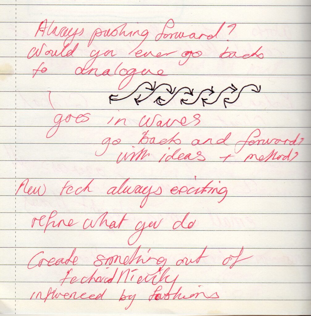
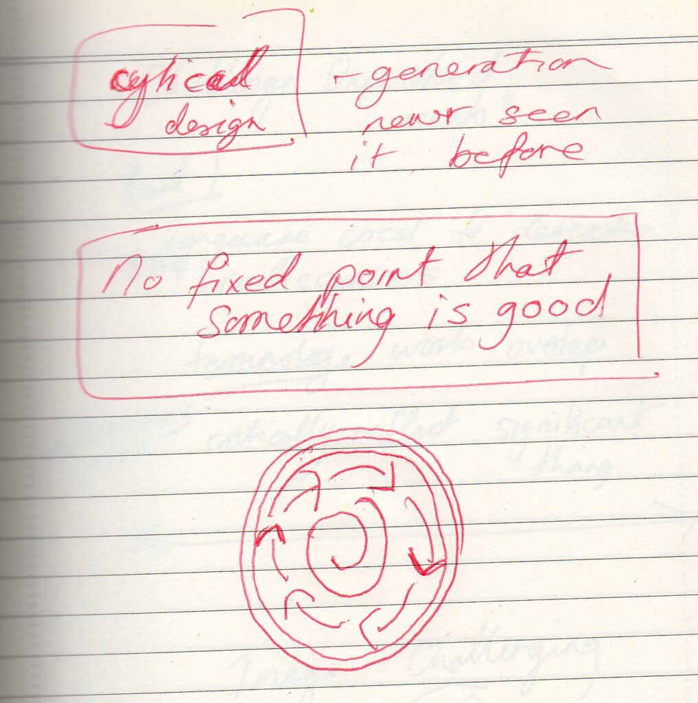
It was interesting to hear the idea that designing goes in waves, like sound or the sea pulling backwards and forwards until the wave reaches the shore and the design has crashed upon the beach, only to be pulled back and remingled and reimagined. Design goes in cycles, things that may have been before are new to the current generation. It was great in the lecture to hear the phrase ‘There is no fixed point that something is good’. I understood this to mean that things can go in and out of style and fashion, and just because something is currently out of favour doesn’t mean it won’t become desirable again at some future point.
Boundaries of Graphic Design#2
There are a staggering 40 Categories on the D&AD website;
1 Animation/2. Art Direction/ 3.Book Design/ 4. Branding/ 5. Casting/ 6.Cinematography/ 7. Collaborative/ 8. Commerce/ 9.Creative Transformation/ 10. Digital/ 11.Digital Design/ 12. Direct/ 13. Direction/ 14. Editing/ 15. Entertainment/ 16. Experimental / 17. Film/ 18. Future impact/ 19. Gaming & virtual worlds/ 20. Graphic Design/ 21.Illustration/ 22. Impact/ 23. Integrated/ 24 Magazine & Newspaper design/ 25. Media/ 26. Music Videos/ 27. Packaging Design/ 28. Photography/ 29. PR/ 30. Press & Outdoor/ 30. Product Design/ 32. Radio & Audio/ 33. Side Hustle/ 34. Sound design & use of music/35. Spatial Design/ 36. Type design & lettering/ 37. Typography/ 38. Visual effects/ 39. Writing for advertising/ 40. Writing for design
Graphic design crosses the boundaries into most of these categories,
Under Graphic design there are a further twelve categories. I think there is possibly more graphic design going on outside the graphics design category, than is in it. Although I do like the art abstract of the posters. The book category very clearly incompases graphic design as does the illustration category
- Websites and Apps
- Posters
- Graphic Design/Motion Design
- Self Promotion
- Environmental
- Applied Print Graphics
- Integrated
- Data Visualization
- Stationary
- Catalogues, Brochures & Annuals
- Direct Mail
- Records
I notice looking through the different categories that the same sub category can appear in many of them.
I suppose they have to put things in categories, otherwise it would all be a big jumble of stuff, and many of the categories will overlap
For example the future impact category, looking at the Smart Period. Whilst this is a fundamentally scientific thing, the page we see has been created by graphic designers, to inform about the service.The box it comes in also comes under graphic/packaging design. The packaging looks rather like a box of herbal/fruit tea which is reminiscent of the lecture from Pearlfisher, taking design ideas from elsewhere- not looking at the competitors or similar products.
The O.N.E- Hope Couture is interesting, it comes under Graphic Design, they have created a design based on QR codes, making a textiles print from the colours seen around the areas where homeless people live to raise money for the homeless, so this is also going into textiles, I notice with interest there isn’t a separate category for textile design.
I think I could do with using the Struggly app on this task, it is shortlisted for several categories including Digital Design/ New Services and Tools/Branding and Digital.
The number of category nominations for each design clearly shows the cross over of boundaries, some designs are nominated under maybe one or two categories whilst others, such as the beautiful Scratchboards come under several Direct/Printed materials/ Experimental/Community Activations/ Gaming and virtual worlds/User Participation, but not graph design or illustration
Also love this, I now know why I’ve been secretly attracted to Comic Sans my whole life, again I’m not sure if it crosses boundaries and weirdly this come under the category of art Direction
There’s Nothing Comic About Dyslexia | D&AD Awards 2023 Pencil Winner | Direct | D&AD (dandad.org)
The more I look around these categories the stranger it is becoming, surely the above should come under Type design and lettering, or Typography?
A design that breaks the boundaries
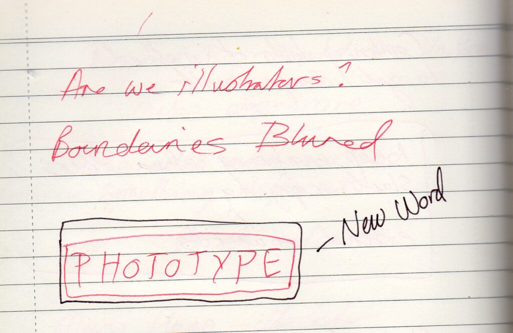
I have looked at the dot pad as a boundary breaking ‘thing’, a screen that allows blind people to see visuals and graphics with their fingers on a screen, it seem an extension of brail reading which would hopefully allow blind people to visualize on screen graphics, I am not sure if it comes under ‘graphic design’ per se but does come under product design, and as graphic designers are also involved in product then I guess it does by default?
Another possibility is Figma, but again this is more tool than an outcome, so I’m not sure this is really what I’m looking for, but it will hep designers with geographical boundaries and time zones, in themselves a bit of a boundary, but not necessarily a design boundary.
Figma: the collaborative interface design tool.
Also love this, I now know why I’ve been secretly attracted Comic Sans my whole life, again I’m not sure if it crosses boundaries and weirdly this come under the category of art Direction
There’s Nothing Comic About Dyslexia | D&AD Awards 2023 Pencil Winner | Direct | D&AD (dandad.org)
This one ↓
Boundaries of Graphic #3
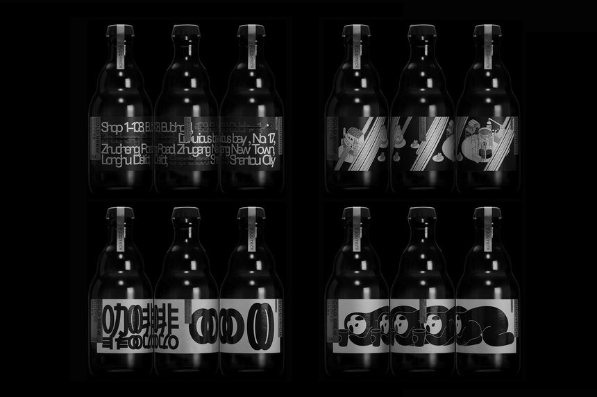
Buddyrich Coffee is a small coffee shop with a young audience that likes to try new flavours. Similar coffee shops often just present logos or simple brand elements in their designs. For Buddyrich Coffee, Lin Shaobin Design Shenzhen chose to use brand imagery, building illustrations, details about the coffee shop, and a blend of Chinese and English typography. A variety of elements captures the multifaceted personality of the brand
I have chosen Buddyrich Coffee from the DandAD site, for me this is an example of a design that crosses the arbitrary boundaries we have assigned them. It won the prize for packaging design/small batch and was also shortlisted for graphic design/applied print graphics and packaging design labels. Already in the nominations we can see that this is appearing in several categories
It has stylish yet fun artwork, I was drawn to the simple two tone, black and white/grey colour palette. There are four separate designs for the bottles.These four distinct designs are; a lounging animal, a diagram of the coffee bean process, English Language Typography and Chinese Language Calligraphy. They work well individually as well as seeing all four designs together, or in any combination. Although each design appears on one product at a time I am seeing all four designs as one, I think the design boundaries are being crossed by seeing all four images together.
The one that got my attention initially is the sleeping panda, drinking his coffee for a wake up. An animal of some kind always gets my attention, I think this does for many people as it has the ‘cute factor’. I originally presumed it is a panda due to it being Chinese and who doesn’t associate the panda with China? Although on closer inspection I think it is a sleeping sloth, using the coffee to wake up, which makes sense, as although pandas are pretty sleepy, the sloth wins first prize for sleepiness, and probably needs the coffee a little more.
The diagram of the bean processing plant looks like it has been inspired by an Escher illustration, without the optical illusion element, it doesn’t go on into infinity but at a first glance I thought it did. It has a similar visual style with elements that lead the eye round the illustration so taking inspiration from art that has come before .
The typography of the Chinese bottle looks particularly abstract and mirrors the curves of the sloth, or perhaps it is the sloth that follows the curvature of the Chinese calligraphy, either way they complement each other and are in direct contrast to the less flowing and more regular font of the English text. The typography of the English language bottle follows the more structured layout of the coffee bean process image.
There are shapes that go across all designs bringing them together as one. In particular the round face of the sloth is echoed in the ellipse in the process image and again in the ellipses of the Chinese calligraphy design . Each of the bottles has the cold brew coffee label/logo in the same. The type style is similar in both the languages in that the individual letters or forms have overlapping edges.
It has an unusual shape bottle for a coffee product, it is more reminiscent of a juice bottle, or perhaps Olive Oil,
Having four separate designs that work well together or separately makes it visually interesting, and different to a usual uniform design, possibly pushing the boundaries.
Buddyrich Coffee | D&AD Awards 2023 Shortlist | Applied Print Graphics | D&AD (dandad.org)
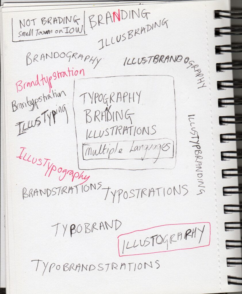
Illustbrandography
The combination of Illustration, branding and typography to create a visually pleasing, recognisable and informative piece of (design) work.
A few further notes & scribbles