After a false start, which I have have shelved for later in the course, due to it being too big for the allotted time (a study into Lithium mining and its effects on local eco systems vs the Electric Vehicle market and air pollution, an awareness campaign).
I have decided to look closer to home for my inspiration.
The lecture said to follow on from module one, which I am closer to doing with what I plan.
When I interviewed film maker Tony Steyger he asked if I knew any young people who had had mental health issues who would be willing to talk and make a short film raising awareness of mental health issues young people face to the echelons of power. The answer was yes, and the young person, my dyslexic daughter was happy to take part. The end result is quite a depressing watch, but it will hopefully do it’s job and get people talking.
I would like to design a thing, an object that is small and tactile and appealing to young people that can be distributed strategically to make them aware of mental health support and social opportunities available for young people on the Island.
I will talk to Jan at Isle Access (the charity that commissioned the film) to gain an idea of information that should be included. After some consideration, and a look at the ideas wall, I think I could include more that just the initial object, such as a bill board poster, or posters on busses etc. A couple of people on the ideas wall have said they don’t really understand what I’m doing, I have tried to explain again, but I am still not sure if I am making sense to them. My eldest daughter says I often speak in a back to front way which also will also come through in my writing. Not helpful in this instance and I’m not really sure how to re-word
I think to do this will incorporate my initial research into design production (week 2, chat with Tony), along with the ‘Noticing the Ignored brief’, plus the desolate and optimism emotions felt in ‘Message Delivered’ . Although a step away from these briefs visually, I feel these people can easily be ignored in society, making life pretty desolate for them.
I definitely do not want this to be an app to download, but it could potentially contain information pointing in the direction of an app.
Initial thoughts were along the lines of something credit/business card size.
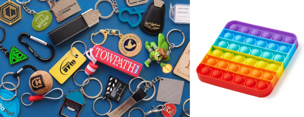
Key fob?
Normally a decorate item, it’s only function is to personalise keys.
Isle Connect, using similarities in name with Isle access. Isle Connect could be a platform to connect young people to services, opportunities and others in similar isolated situations on the island.
How do young lonely people with no social network find out about Isle Connect? To try to find and help these people there could be a huge local campaign, in schools, colleges, youth groups, all youth mental health services, libraries and other pubic spaces, the pier, bowling alley, local news and social media, shops (everyone need to eat). But done in a subtle and sensitive way, that will not intimidate anyone with anxiety issues.
Database of information, I’m not sure if this exists in any user friendly way at all, (the council must have the information somewhere though). I will make suggestions that a one stop destination for all young person mental health services, short course education, social groups, opportunities, counselling etc be in one place. A QR on the item I design could take you straight to this information,
Lifeline: 18% more calls by Genesis for Lifeline NI (creativepool.com)
Isle Access – Your directory to the accessible Isle of Wight
Above, just a few of the services on offer, found because I have already heard of them. How to get the message out there to people looking for services but don’t know where to begin.
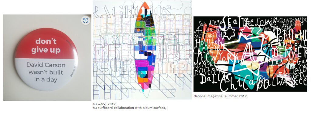
I was drawn to these three images, the badge because it is a small object, with a positive message, that could appeal to my audience. The surf board wowed me, of all the surfboard designs on his website I found this one most appealing, I like the layering of lines that make up the letter, it feels industrial, you have to look closely and it is difficult to read, like a hidden subtle message, The third image, although different in style to the second, more hand drawn again uses the layering, it took me a while to notice the USA map underneath the words, and also to register that the words are the States.
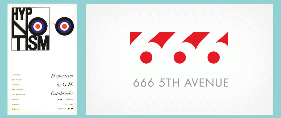
I also like these, Milton Glaser, again a slightly hidden message, I like the use of negative space to make the numbers, and the ‘look into my eyes’ of the hypnotism design.
Stauffer Center (pentagram.com)
Note to self; Try not to be utterly intimidated when looking at Pentagram, listen to David Carson!
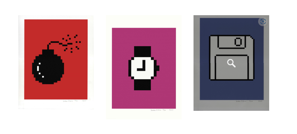
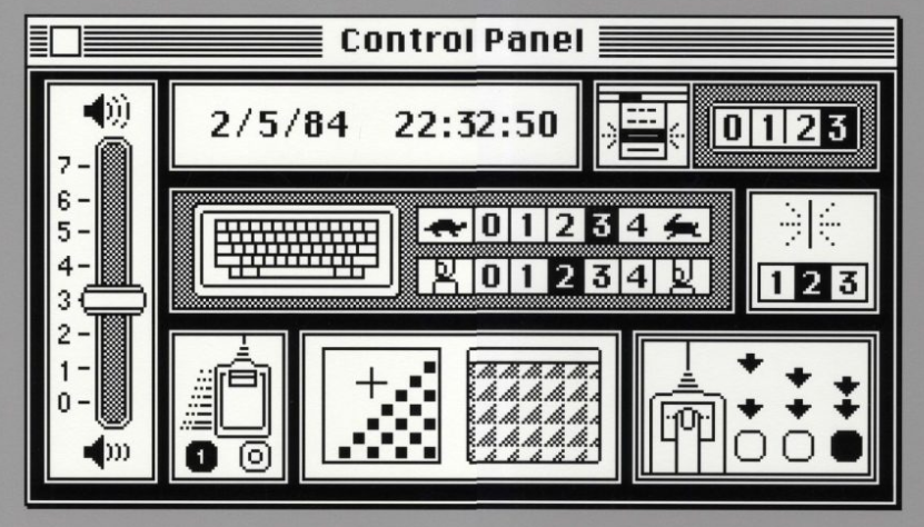
Margaret Calvert | Biography, Designs and Facts (famousgraphicdesigners.org)
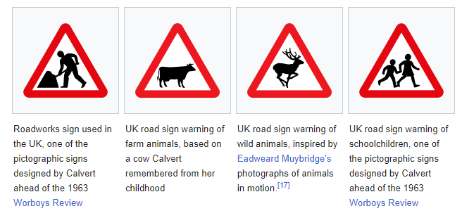
I am also inspired by the Margaret Calvert’s road signs, they are easy to understand and tell a very clear message- following from this I thought to look at icons, the pre-curser to the emoji; Susan Kare, Apple. I need to ask my young people if icons and emoji’s are still a thing, or if something else has taken their place (getting old here).
I thought of some kind of key chain containing information could do the job, but my daughter told me she thought some kind of fidget toy would be more appealing for the target audience.
I then thought perhaps a paper fortune teller, it has the fidget element and would be cheap to produce, this is for a charity so cost is important, it could be easily distributed as it folds flat, and would have a large surface area to contain information.
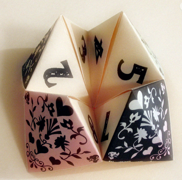
I then had a little poke about in the paper folds of origami, whilst these are fascinating and I personally love Japanese art, it is probably not that relevant to young people on the Isle of Wight. I am swinging towards the fortune teller as a base for my design; most of us remember making them as children, a fun game to play with friends. Again I need to clarify with the group if this is something that would be suitable.
I also like the ‘good fortune’ element associated with the fortune teller, to seek, to open the folds and find positive information- which is in parallel to the target audience.
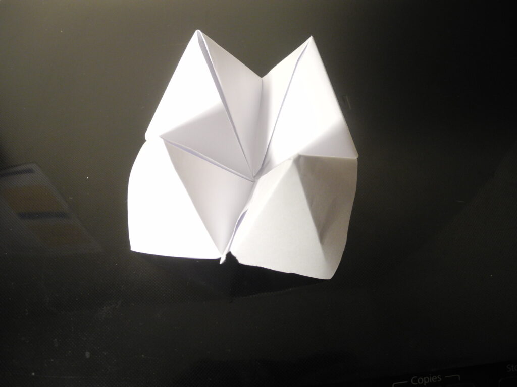
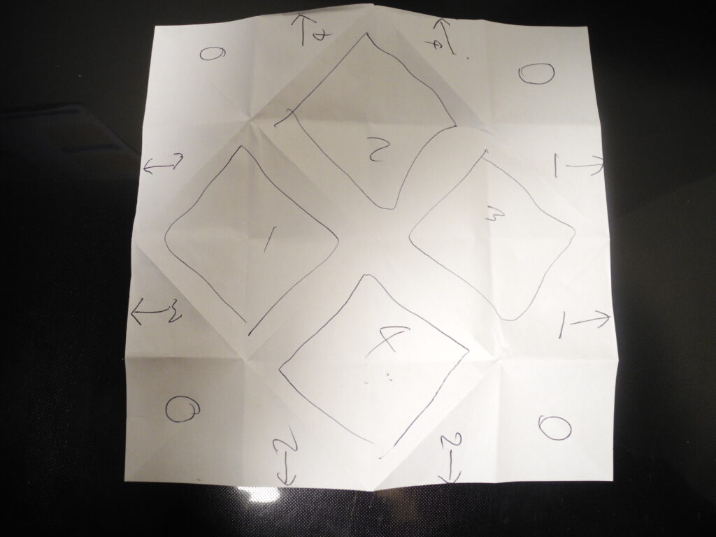
Remembering childhood and the folds to make a fortune teller.
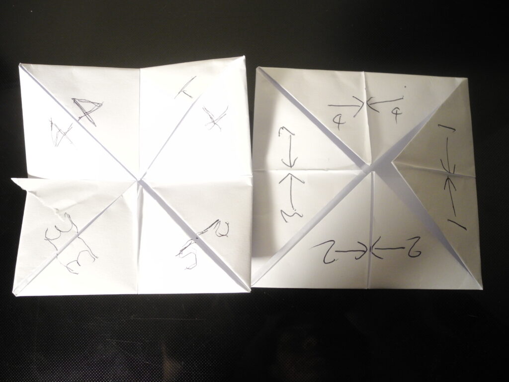
I have mapped out the surfaces available after folding, this clearly shows me the number of surfaces to fill, it also leaves me with one big surface, the back. Now to consider what goes on it…
I really could do with watching the film again to remind me of the most important things to include. I remember a big one being loneliness, so I will take a look a that whist waiting to hear back from Isleconnect.
- Emotional loneliness – ‘the absence of meaningful relationships’
- Social loneliness – a ‘perceived deficit in the quality of social connections’
- Existential loneliness – a ‘feeling of fundamental separateness from others and the wider world’
Upon asking my 19yr old daughter how she could be reached if she was sitting in her room feeling lonely I hit a blank wall. Would some kind of printed info/tactile object reach you or would something online be better? A resounding ‘duno, may not read something printed, and not sure if I’d see something online’ doesn’t leave me any clearer. My only way to go is proceed with imagery and think of end application further down the line, as suggested by Theresa on the wall.